Chris wants to expand his client base. He wants his photography and branding to be presented in an environment that reflects his work ethic and highlights his photography.
Chris needs a contemporary site that shows his variety of work, excite a potential customer and relay the message to contact Chris to discuss the potential photo shoot in mind.
Researcher
UX Designer
UI Designer
Testing Coordinator
While setting up the One on One interviews I took a look at some local photographers sites:
* Most sites were not consistent with type hierarchy or over site layout.
* Some came across as a photo dump with little organization.
* Site navigation was not consistent.
* Lots of dead links.
Scottspiter.com
* The Contact page has a very detailed form.
* Social Media Presence.
* Base prices are invaluable.
* Alt text is being used.
* Home and Photo link go to same page.
* Contact link is not consistent across site.
* Social Media is not consistent across site.
Samlustiphoto.com
* Images are large and clear.
* Tiles are a nice mix of sizes, breaking up the carousel on the events page.
* Discusses the events that he shoots; this really gives the feeling that he enjoyed what he was photographing that day.
* Multiple Contact Forms on site. All the same except the Wedding form.
* Wedding page is not accessible in menu.
* Contact links outside of menu point to form on Wedding page.
* Text on Images is hard to read.
* White text on pale colored backgrounds is an ADA issue.
* Personal Images pages the formatting is not consistent. Landscapes page is a carousel while Climbing and Music are tiles.
Momentsbyhiba.com
* About page content is very personable and shows the photographers passion and energy.
* Changing the size, color of the key words in her quotes are nice look.
* Palette is relaxing, calming. using white as the main color helps pulls the eye to the photo samples.
* Base prices are very usefull.
* Layout of Contact blends with site design.
* Did not ignore the alt text descriptions.
* Has inactive Social Media links for IG, Facebook and Pinterest. Above the links is a row showing active IG links. Causing a lot of confusion with Social Media, IG in particular.
* Button are not consistent, sharing the same styling as headers is confusing.
* Wedding row on Services has a button to a wedding page that is not in any menus. Why bury a major service?
* Portfolio page starts with wedding portfolio open but the wedding tile does not indicate it is active leaving thinking there is another separate wedding page.
* Contact is very hard to read due to overlay color and small, thin typeface.
* Alt tags are excessively written, pulling content from other pages. this wil cause confusion to the ADA reader, thinking they are on the wrong page.
Interviews
Interviews were done like what I have been doing recently.
Questions to start the conversation, asking additional questions as we go.
Interviewers wanted a photographer that was a good fit for them on a one to one basis.
Personality should not cancel out professionalism. One didn’t like that a photographer used profanity on their site.
Communication was a big factor. Example: Most had to ask the photographer when the photos would be ready or if a downpayment was needed.
“Give me five of your best photos on a subject instead of one hundred mediocre ones”
— Mackenzie Hilton
Interviewers wanted a photographer that was a good fit for them on a one to one basis.
Personality should not cancel out professionalism. One didn’t like that a photographer used profanity on their site.
Communication was a big factor. Example: Most had to ask the photographer when the photos would be ready or if a downpayment was needed.


POV#1
I'd like to explore ways to help clients to be able to find a photographer to match their personality because they want to make the photoshoot productive and enjoyable.
HMW#1
How might we help the client who is looking for a photographer to connect with the right photographer?
How might we help the client who is nervous to reach out to the photographer?
How might we help the photographer who is displaying his work on his website to show his personality as well.
POV#2
I'd like to explore ways to help a photographer who is looking for assignments to express he is affordable and is willing to negotiate with a client.
HMW#2
How might we help the client who is cost-conscious to reach out to the photographer and discuss pricing for the assignment?
How might we help the photographer who wants to discuss the cost of a project without posting exact costs on the web?
Working through the discoveries and comparing them to Chris’s goals I developed a Venn diagram. The Venn really helped me target an approach to the overall site.
* Increase business opportunities.
* Networking with other photographers to recommend photo shoots that might be in another’s wheel house and vice versa.
* To encourage the user to reach out to discuss business inquirers.
* To improve branding, to be seen as a professional, not as a blogger.
I prioritized on what was needed for getting the site up and ready to start promoting Chris as a photographer for hire.
While photo tagging is an excellent idea, the layout of the site may deem it not needed. This will ultimately depend on final photo count and how criteria for the tags.
Image modals -
The ability to click on image to view in larger size. This may depend on the volume of images.
Contact form -
Form will have multiple headers to choose from. This will help keep the photographers emails organized by subject.
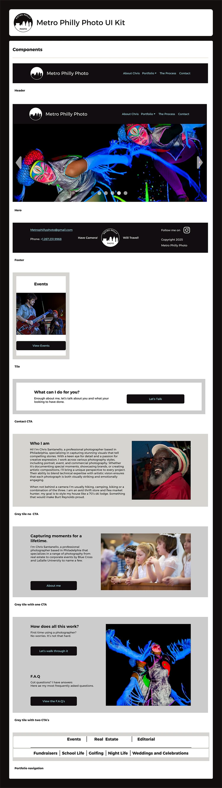
We have priorities and direction. Now it’s time to start setting up the site.
Lo fidelity
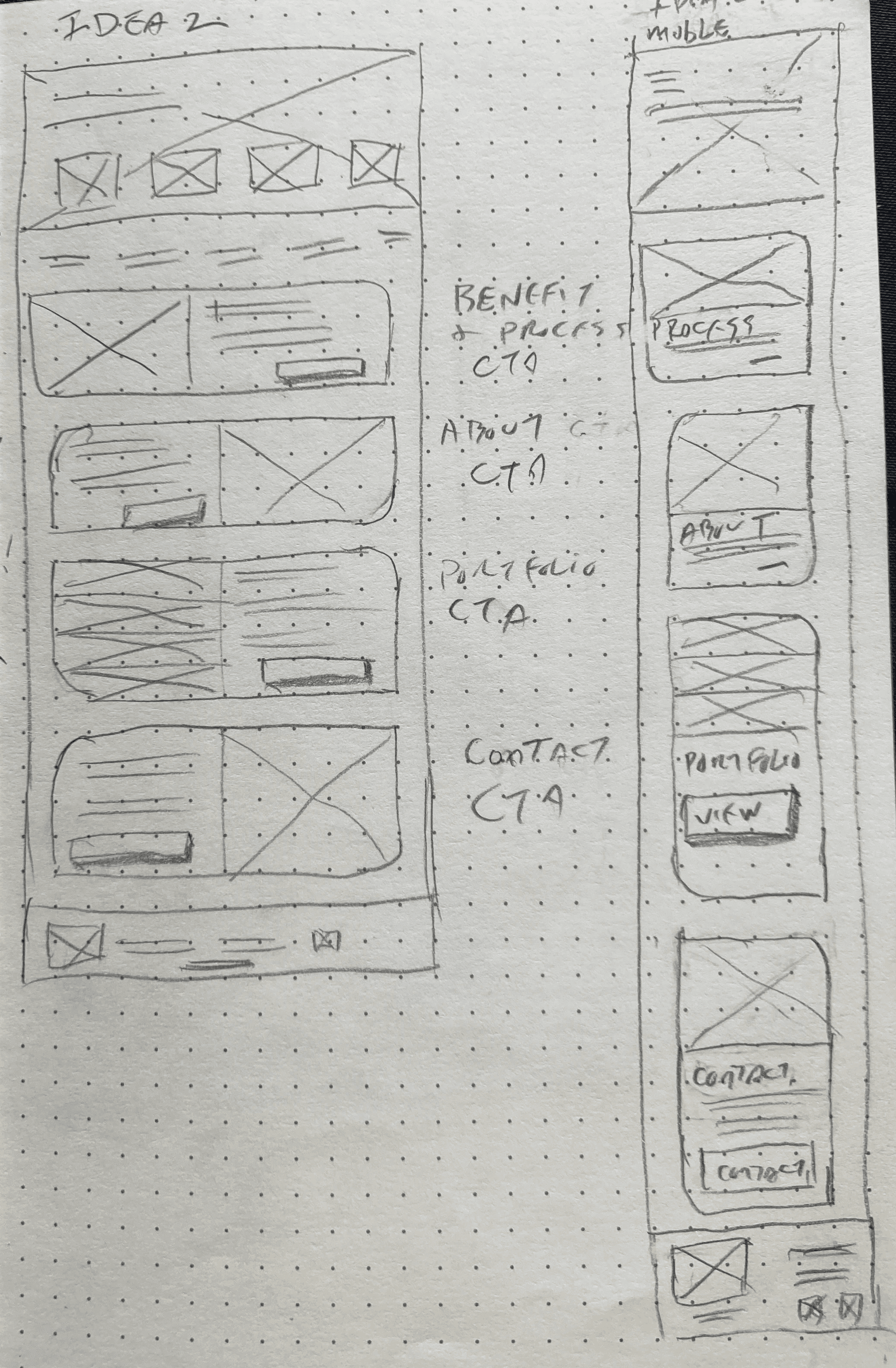
Mid fidelity
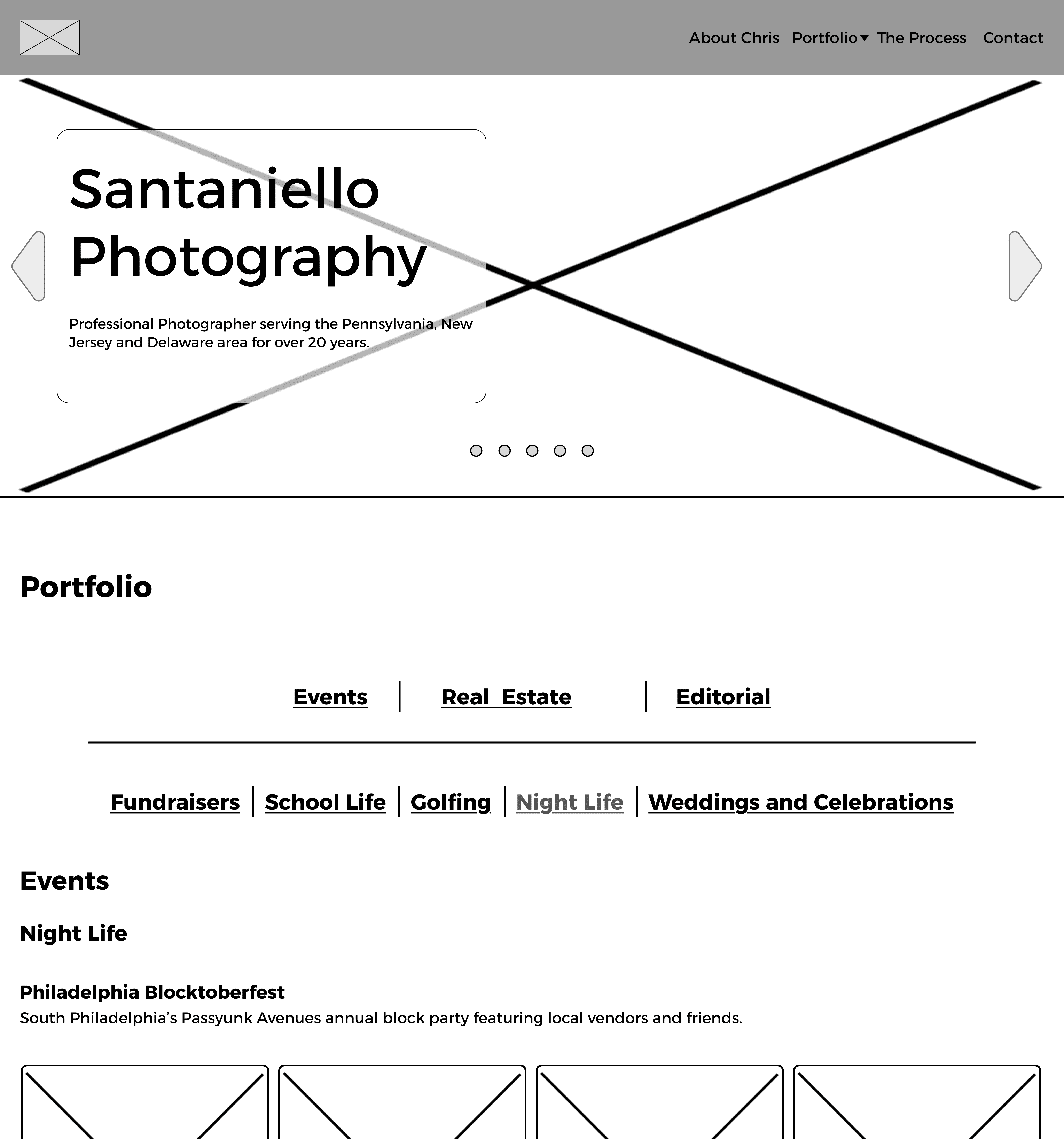
I started developing the Mid Fidelity wireframes, things were really not looking good. It dawned on me I was designing for me and not hearing what the site needed to be. Once I realized this things clicked. I minimize graphic elements, kept things extra clean complementing the photos and not fighting with them.
Before going to High fidelity development I did a few rounds of testing with some volunteers.
A quick walkthrough of how things would flow if you were doing some tasks.
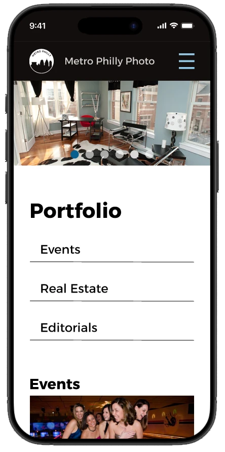
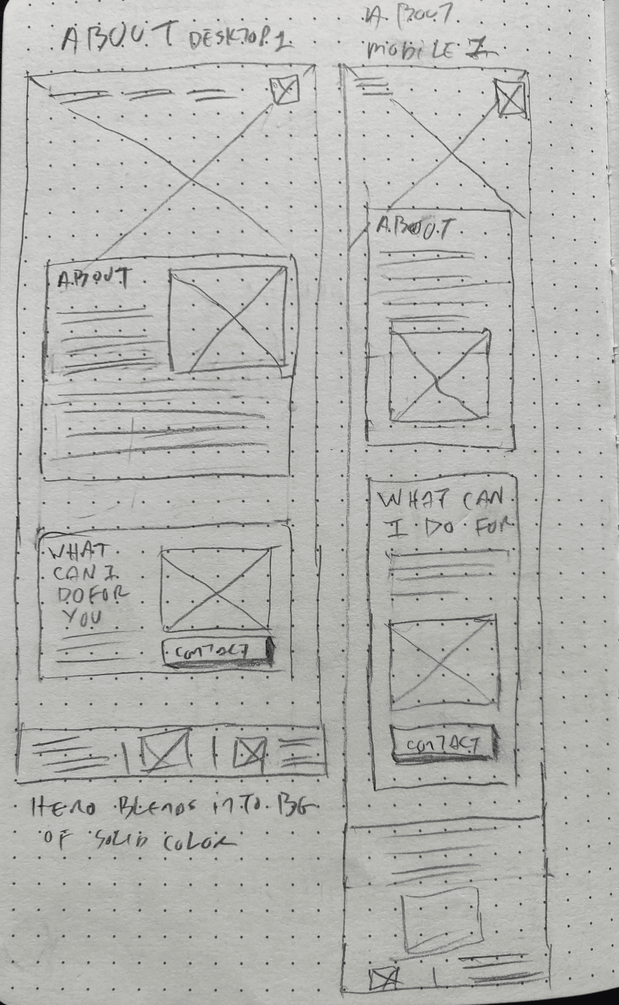
Well glad I did! I noticed a missing page that blocked the task flow. Portfolio page needed to be built out! Not complicated but vitale.
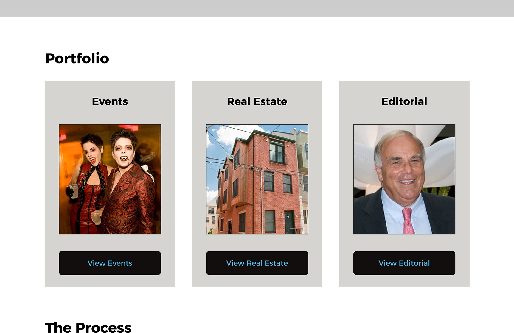
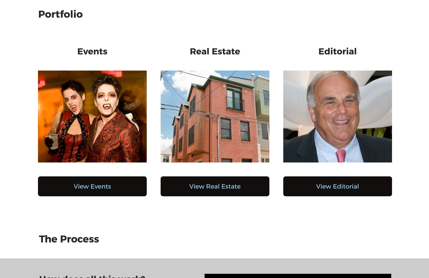
After a follow up meeting with Chris we also refined the portfolio page categories as well naming convention.
We removed Architecture from the level 1 navigation and will merge into Real Estate section. I built out the Events with more specific subsections.
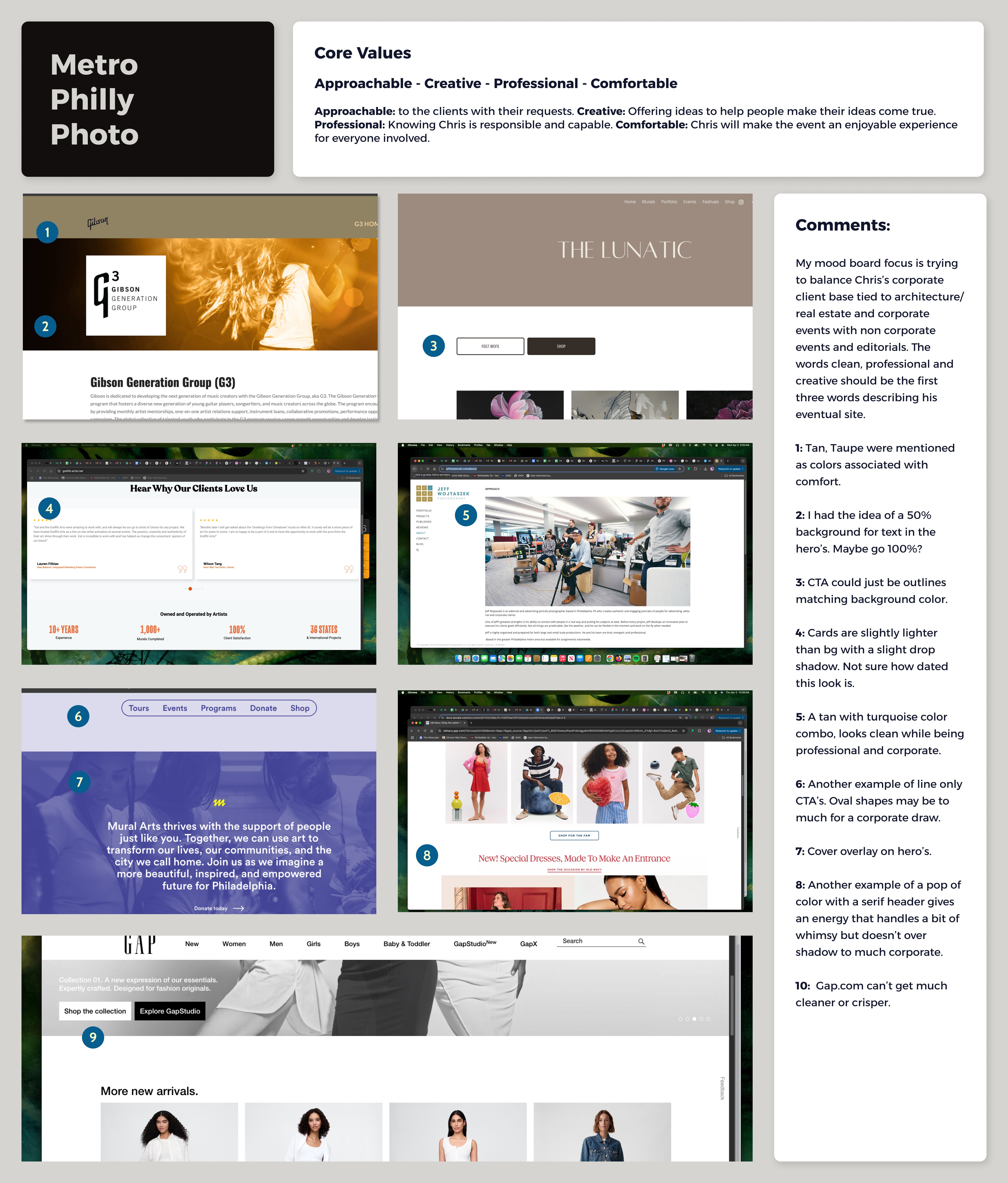
Chris decided to go with the name Metro Philly Photo with the following thoughts:
* Increase business opportunities.
* Networking with other photographers to recommend photo shoots that might be in another’s wheel house and vice versa.
* To encourage the user to reach out to discuss business inquirers.
* To improve branding, to be seen as a professional, not as a blogger.
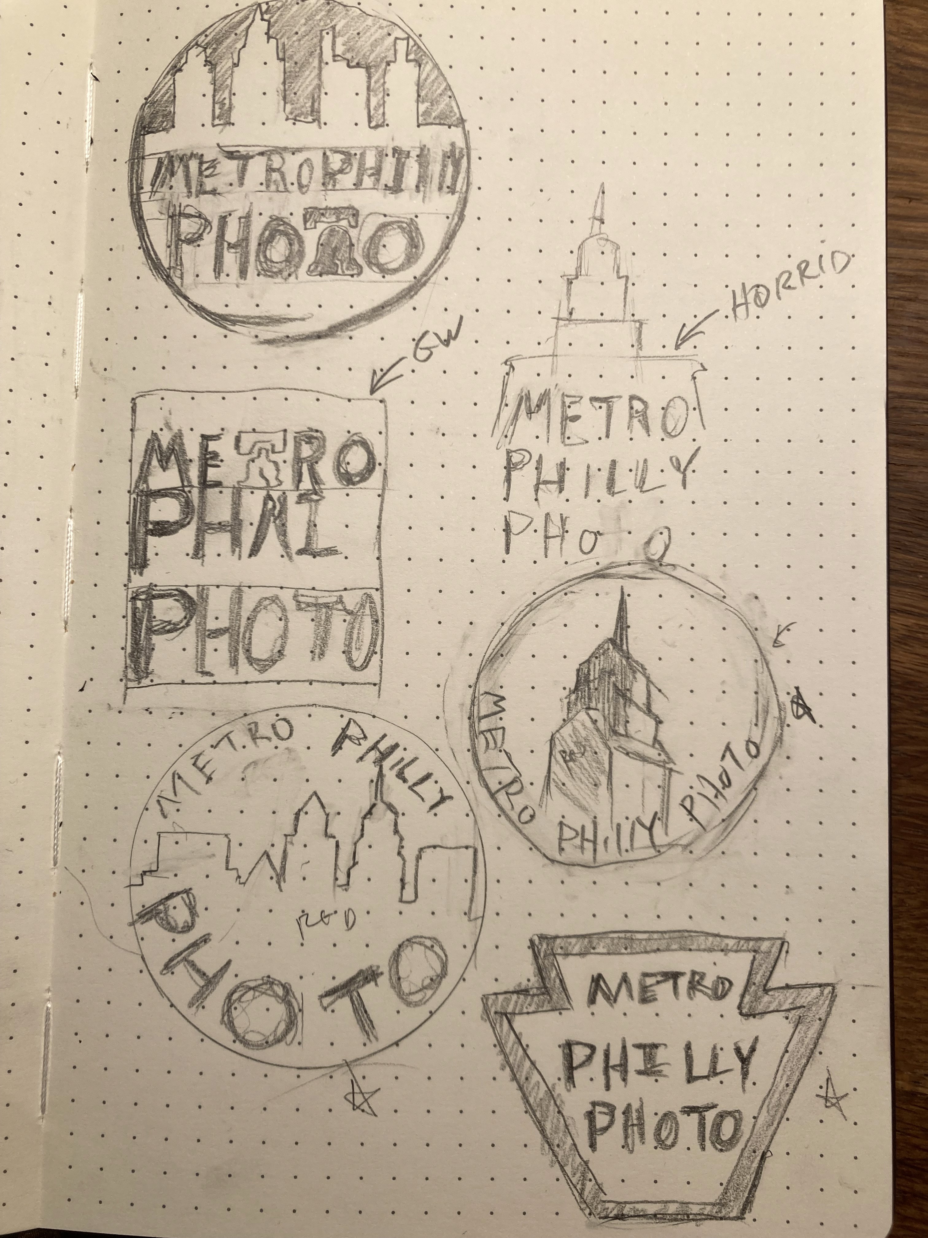
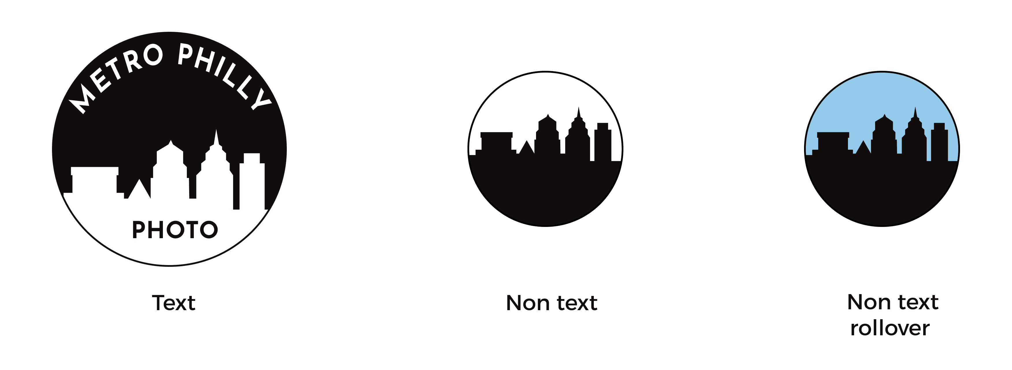
After a few rounds of philadelphia specefic iconic items I went with working the city skyline in a circle. Came up and refined to what you now see.
A large one with text, smaller when the text is not legible and blue and black for rollovers when needed.
Chris suggested red, grey and blue. We played around with the Mid Fidelities adding color in different possible ways. The red was to distracting against the pictures (You’ll see below!).
We eventually agreed on keeping things neutral with blue as a careful touch of color.
#44BF53
#5A5959
#120EOD
#FFFFFF
#065EBE
#D5D4D0
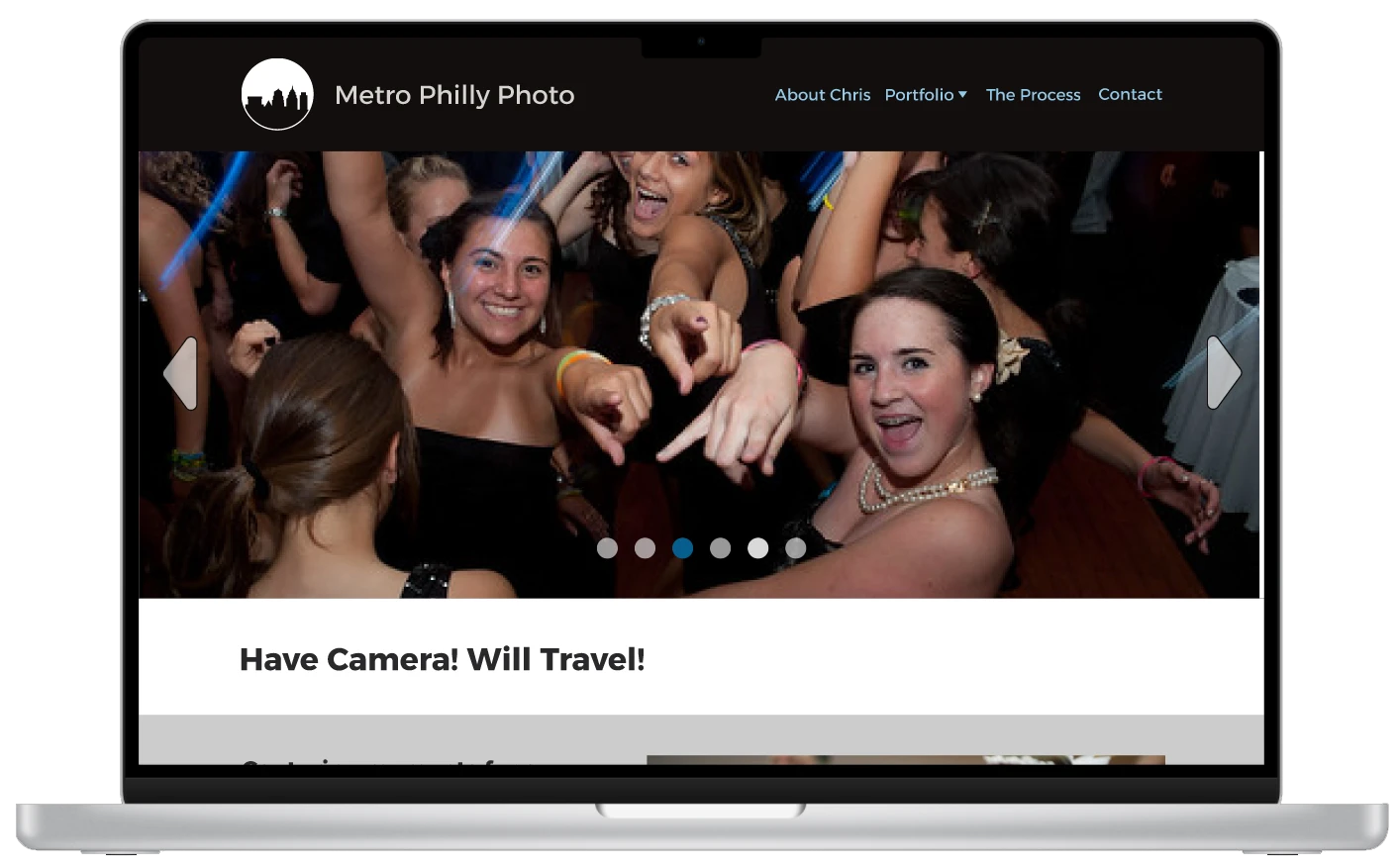
High fidelity
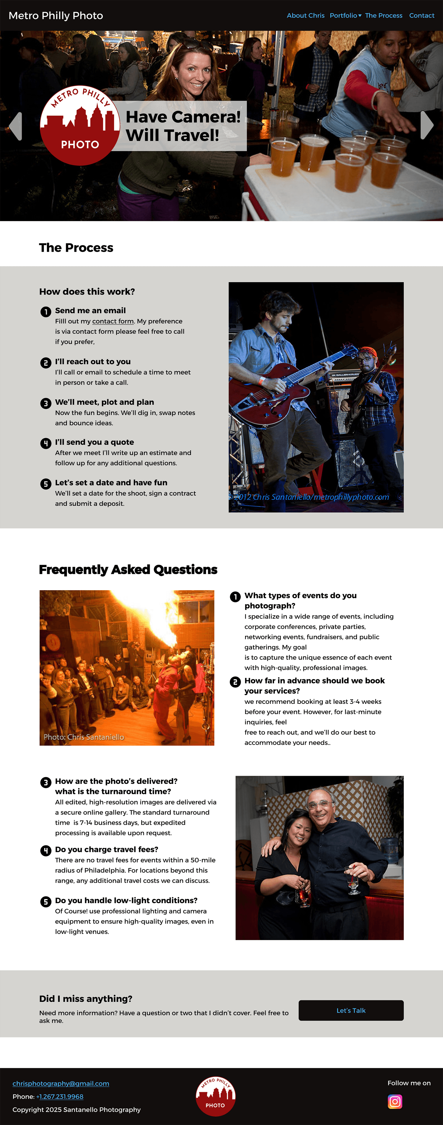
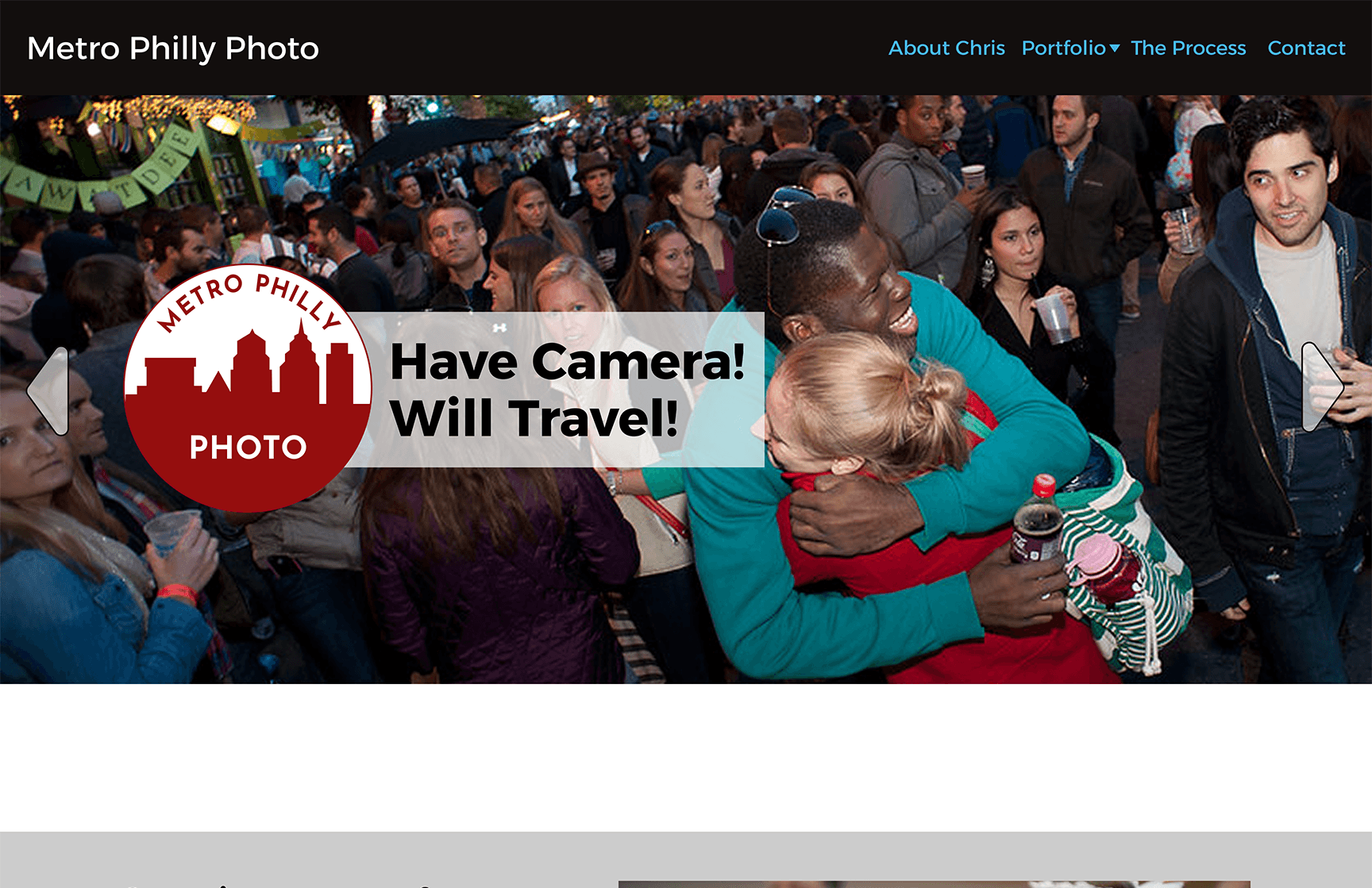
I added the red to the logo as Chris requested, it is taking away from the photos but I want him to see it himself.
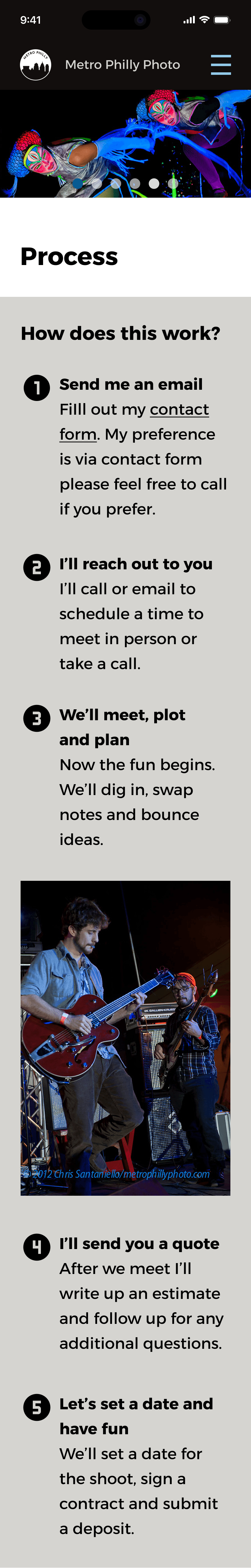
I wrote out the process on how everything works because it was a very common my interviewers had. To encourage users to contact Chris the copy needs to be very friendly and written with personality.
I minimised the colors even more. using a warm grey to help break the page up but not override the photos.
Problem #1
* Logo was well received as well as the catch phrase.
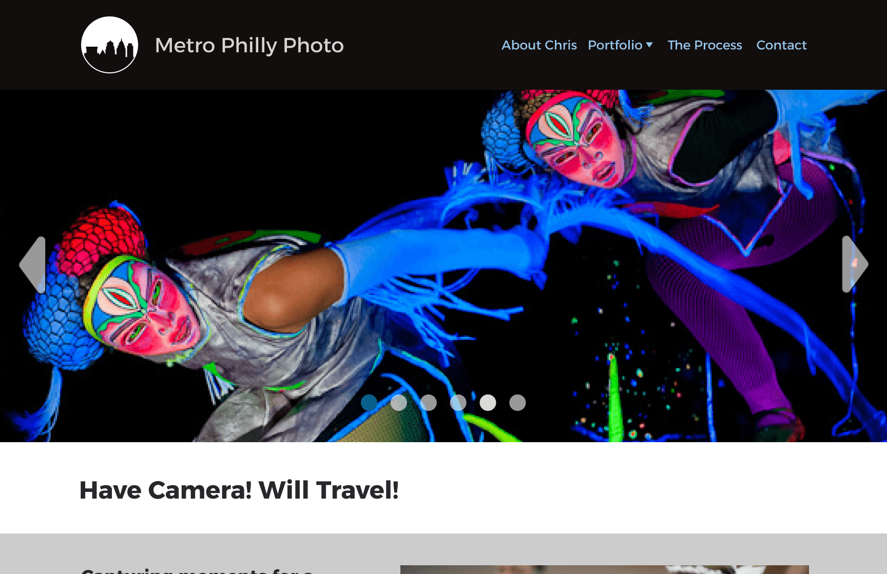
* Having both over the hero was not. Testers wanted to see the images uninterrupted.
* Red was not loved either. They found it to distracting for the images.
Problem #2
The majority found the grey to distracting and would rather see more of the images.
Problem #3
Testers were not sure what the CTA was for.
This particular project reinforced how important the copy is on a site or app. Actually this has been an overarching learning throughout the whole course for me. Initially I wasn’t sure why greeking was not used anymore. Now I realize the personality of the copy needs to be in step with the design of the site.
My first round of design ideas took away from the photos…the purpose of the site is making the photos central.
I realized I was being different just for the sake of being different. Once I stepped back and focused on the purpose of the site, things started to come together.