Develop a site for
Metro Philly Photo
Introduction
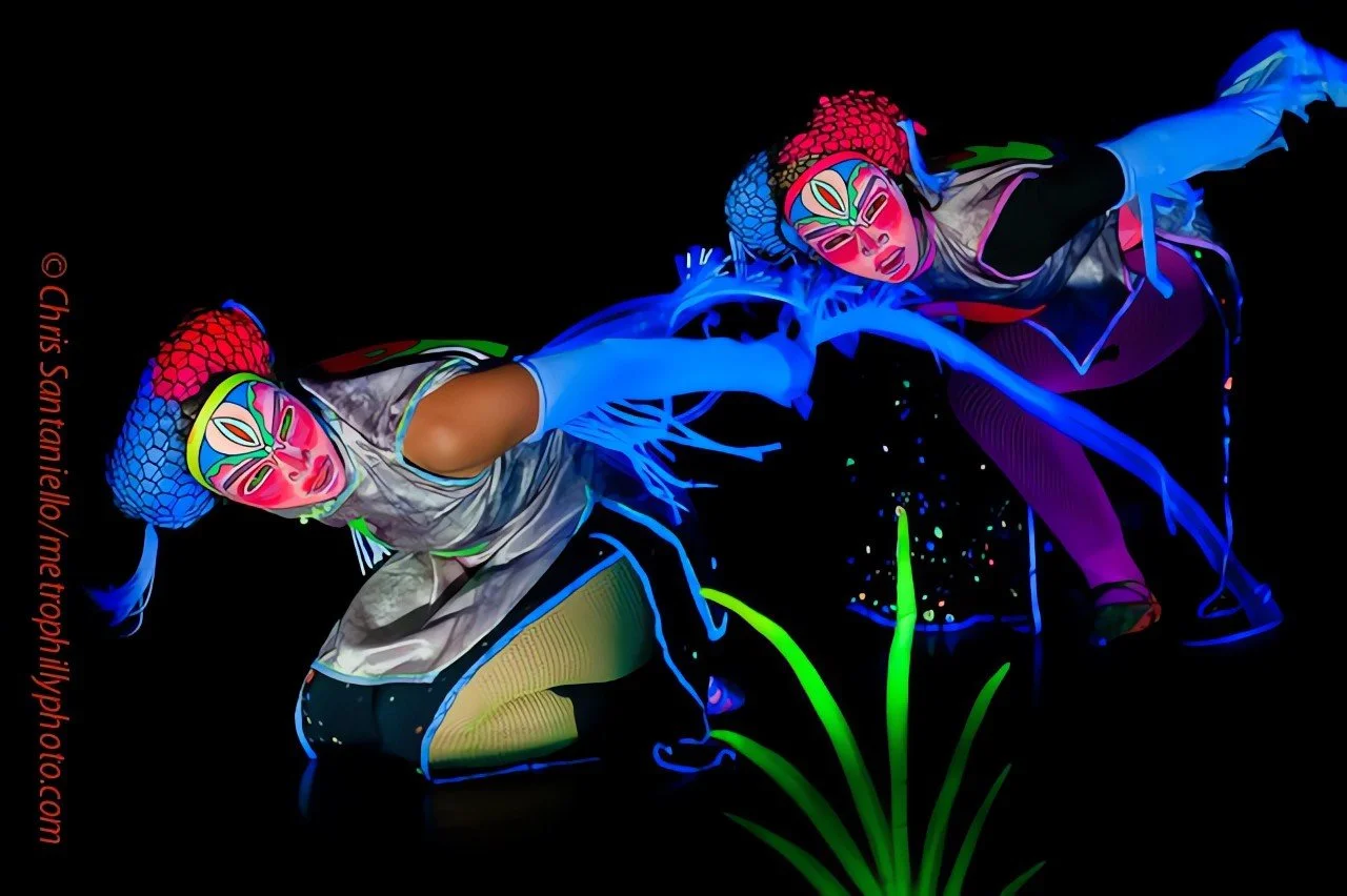
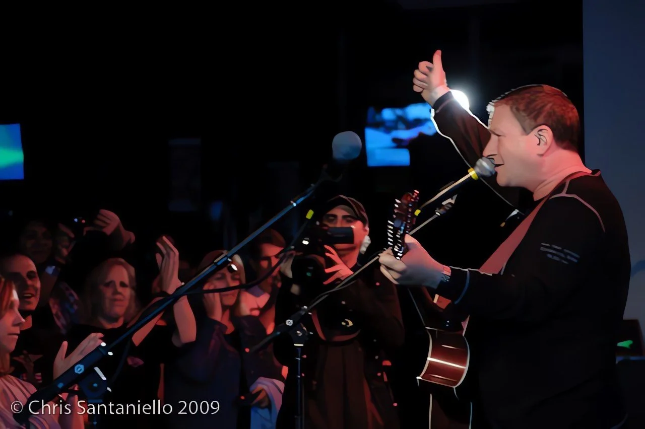
Chris Santaniello has been working as a part time Photographer for over 20 years.
Chris is looking to make the move to full time photographer in 2025.
The problem
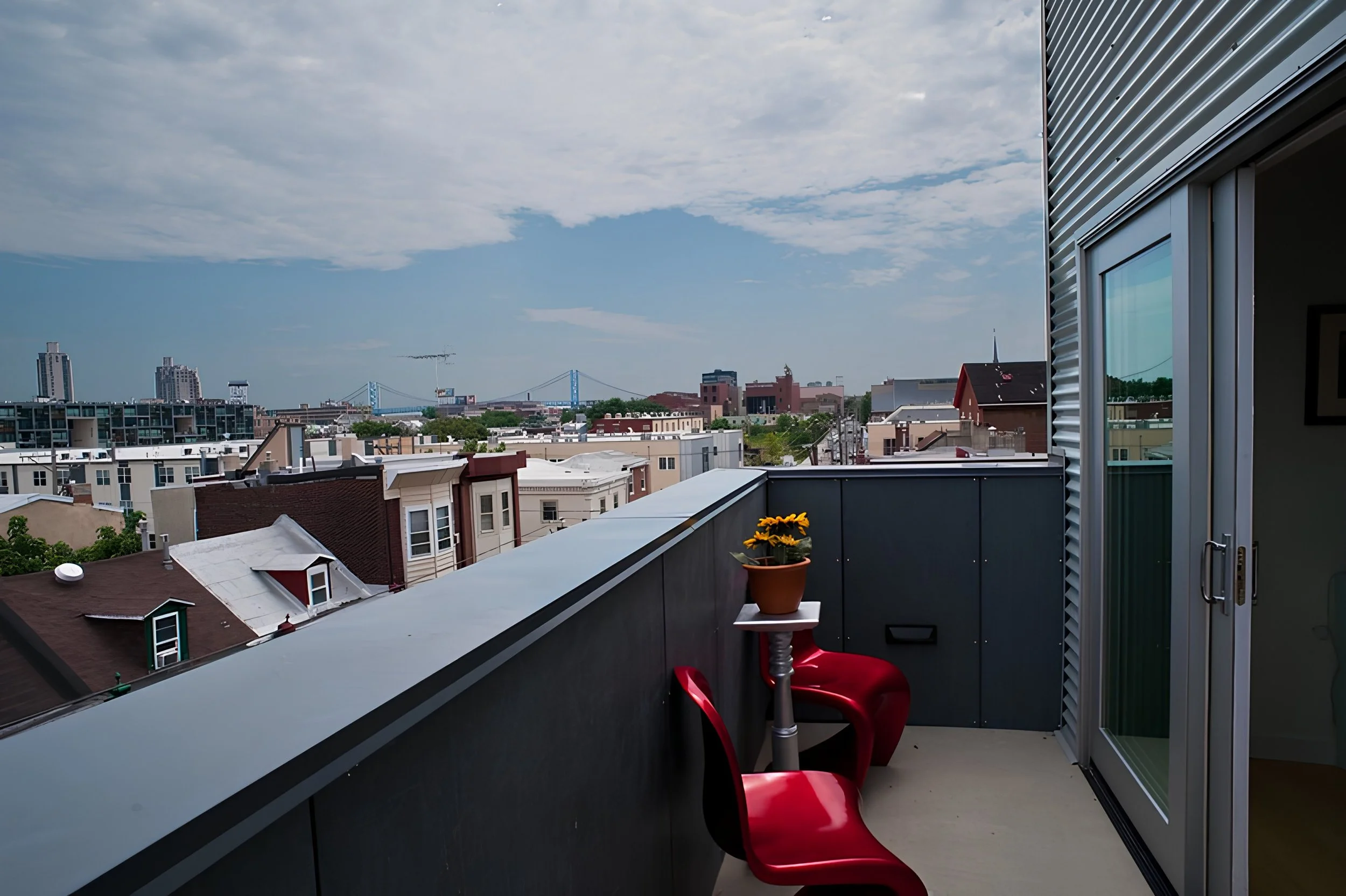
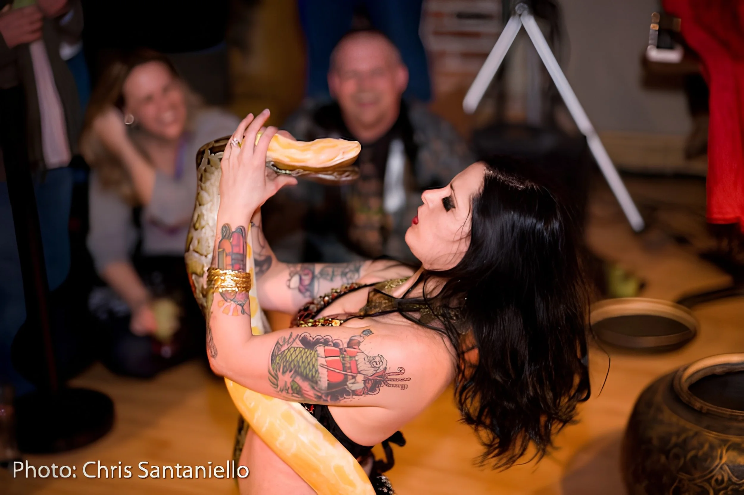
Chris wants to expand his client base. He wants his photography and branding to be presented in an environment that reflects his work ethic and highlights his photography.
Goals
Chris needs a contemporary site that shows his variety of work, excite a potential customer and relay the message to contact Chris to discuss the potential photo shoot in mind.
Roles
Researcher
UX Designer
UI Designer
Testing Coordinator

Research
Interviews
Interviews were done like what I have been doing recently. Questions to start the conversation asking additional questions as we go.
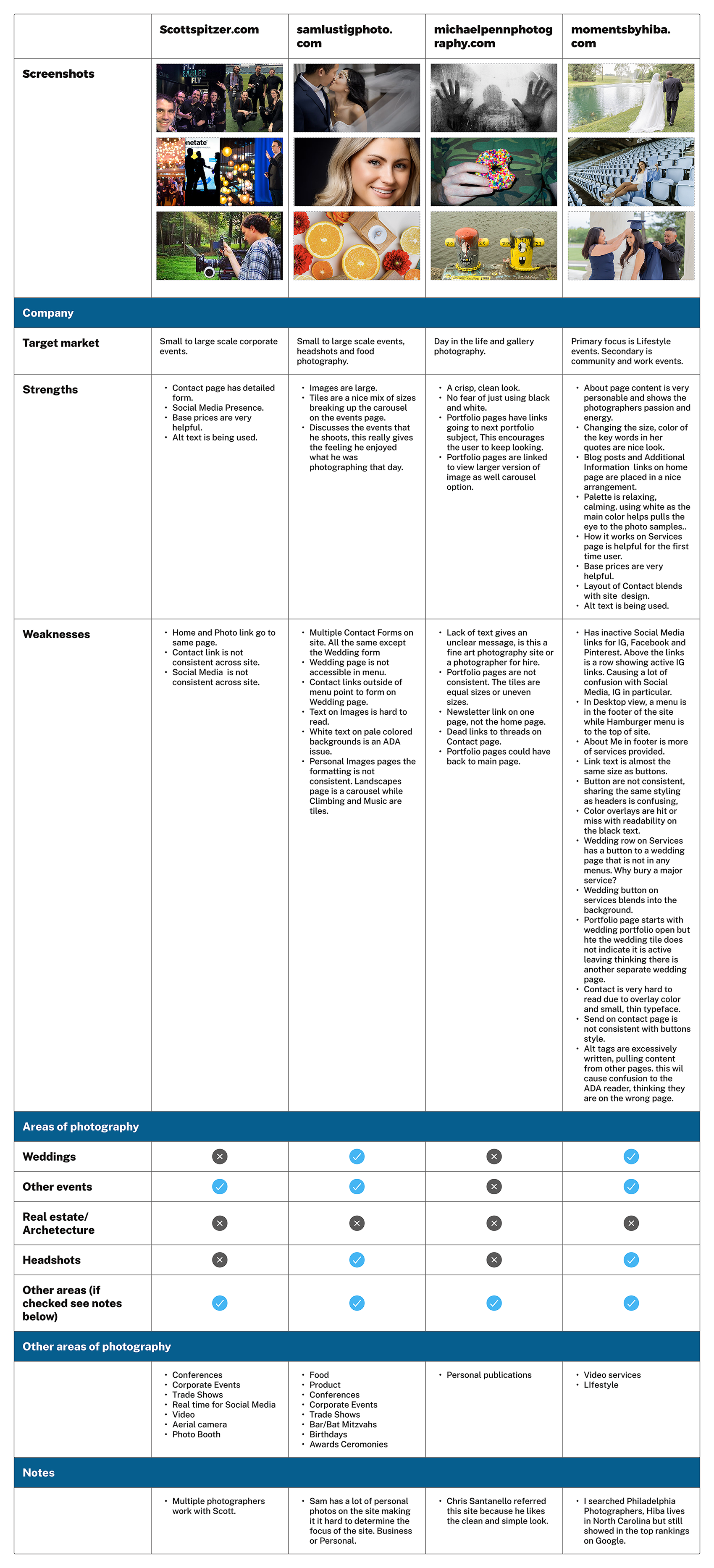
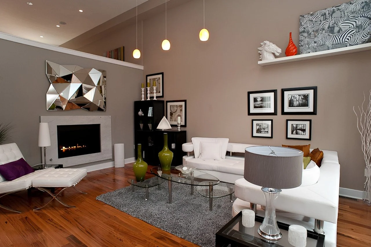
Competitor research
While setting up the One on One interviews I took a look at some local photographers sites:
Most sites were not consistent with type hierarchy or over site layout.
Some came across as a photo dump with little organization.
Site navigation was not consistent.
Lots of dead links.
Interview discoveries
“Give me five of your best photos on a subject instead of one hundred mediocre ones”
Interviewers wanted a photographer that was a good fit for them on a one to one basis.
Personality should not cancel out professionalism. One didn’t like that a photographer used profanity on their site.
Communication was a big factor. Example: Most had to ask the photographer when the photos would be ready or if a downpayment was needed.
Having pricing on the site was a big want.
No preference of email, phone or forms for the initial contact.
Linking to your blog came across as a personal site.
Having an extensive amount of photos was deemed amateurish and felt exhaustive.
Define
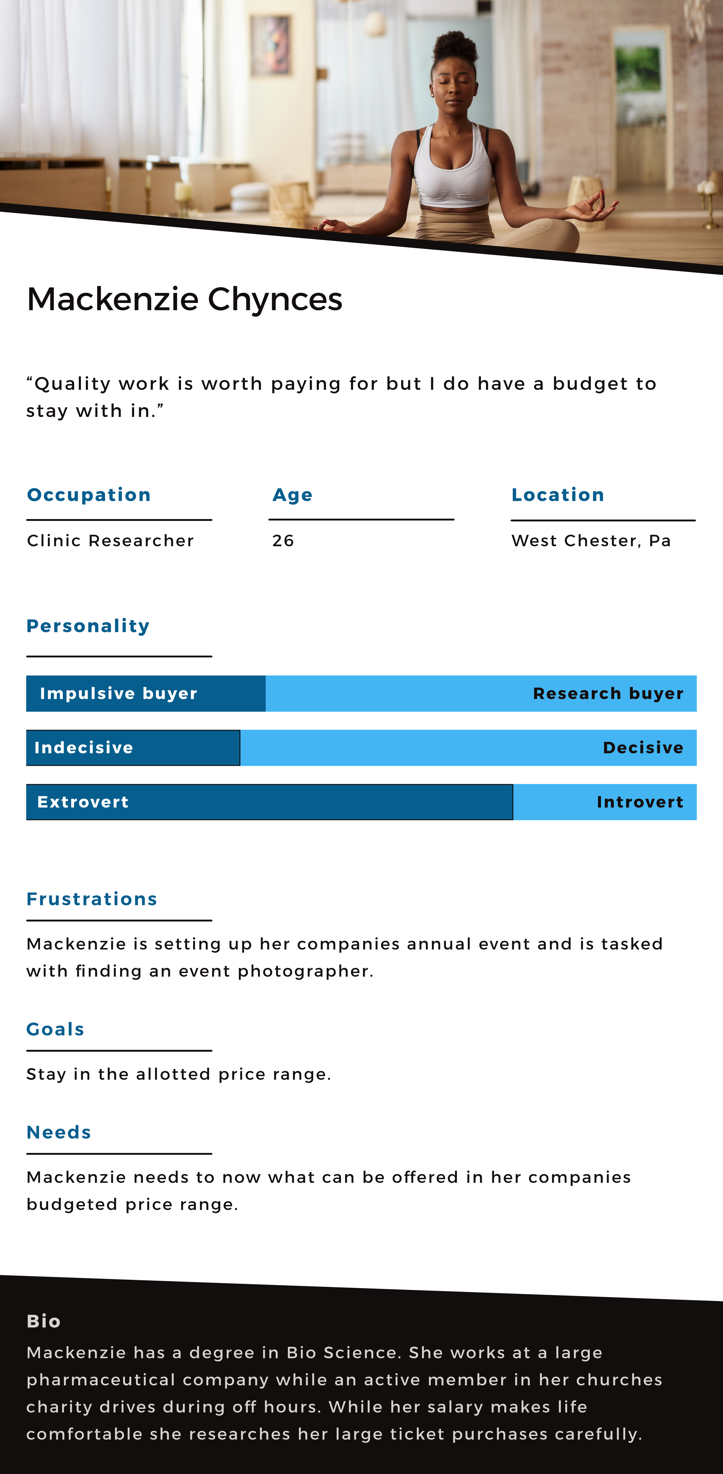
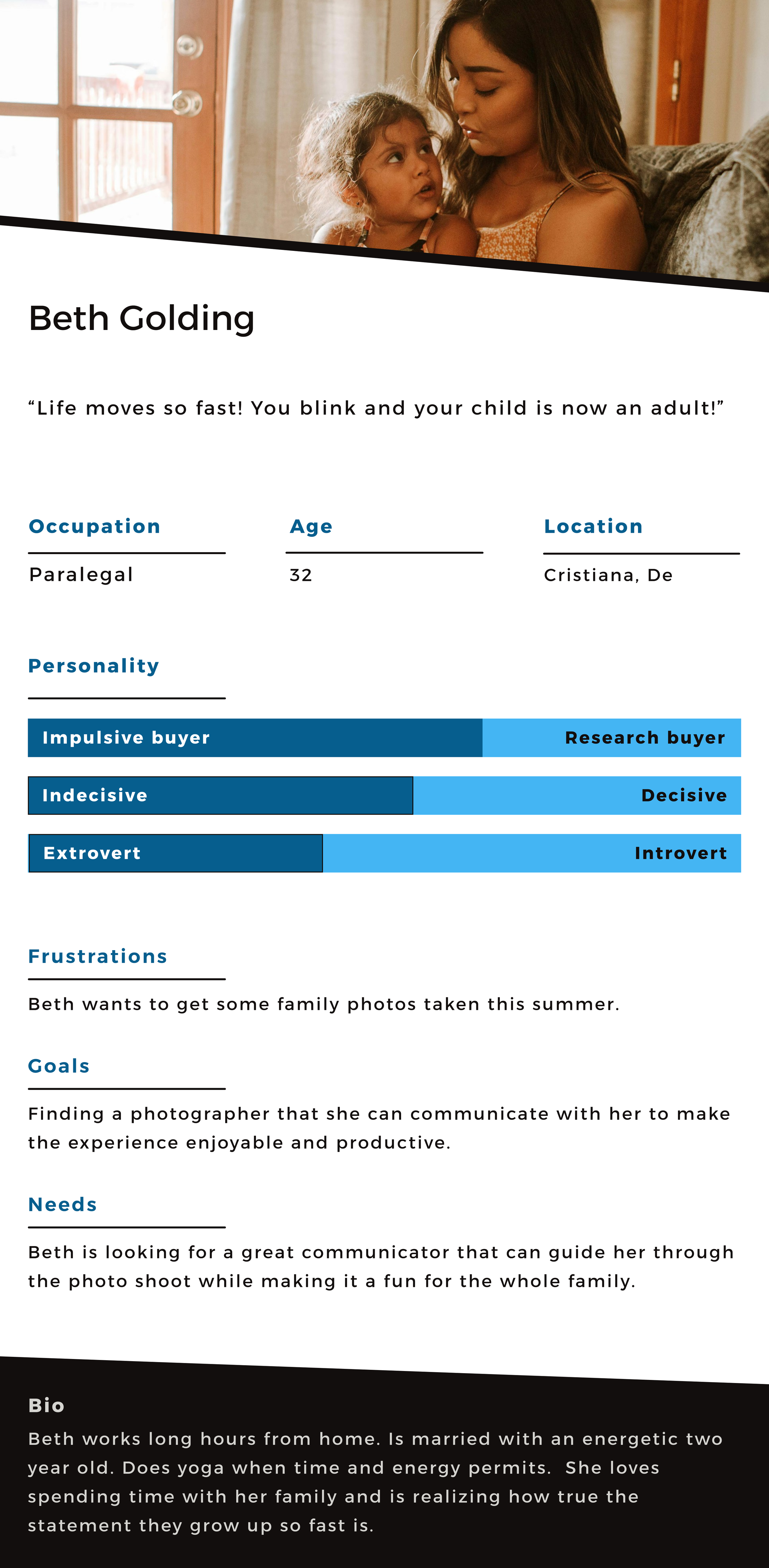
Personas
Problem Statements
POV#1
I'd like to explore ways to help clients to be able to find a photographer to match their personality because they want to make the photoshoot productive and enjoyable.
HMW#1
How might we help the client who is looking for a photographer to connect with the right photographer?
How might we help the client who is nervous to reach out to the photographer?
How might we help the photographer who is displaying his work on his website to show his personality as well.
POV#2
I'd like to explore ways to help a photographer who is looking for assignments to express he is affordable and is willing to negotiate with a client.
HMW#2
How might we help the client who is cost-conscious to reach out to the photographer and discuss pricing for the assignment?
How might we help the photographer who wants to discuss the cost of a project without posting exact costs on the web?
Research leads to goals!
Working through the discoveries and comparing them to Chris’s goals I developed a Venn diagram. The Venn really helped me target an approach to the overall site.

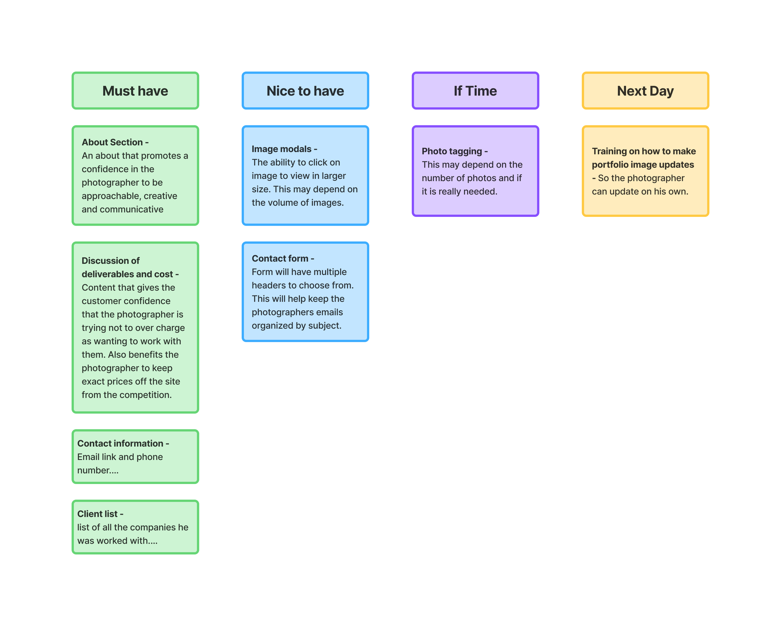
Feature set prioritization
I prioritized on what was needed for getting the site up and ready to start promoting Chris as a photographer for hire.
While photo tagging is an excellent idea, the layout of the site may deem it not needed. This will ultimately depend on final photo count and how criteria for the tags.
Framing the website
We have priorities and direction. Now it’s time to start setting up the site.
Mood board
Searching various design sites for inspiration I created a moodboard with ideas for design and color concepts.

Core values
I took this time to also create the Core Values for the app:
Approachable: to the clients with their requests.
Creative: Offering ideas to help people make their ideas come true.
Professional: Knowing Chris is responsible and capable.
Comfortable: Chris will make the event an enjoyable experience for everyone involved.
Lo fidelity
I wanted the site to stand out and be different from the Photography and product focused sites that I have looked at.
I still wanted it to be clean and minimal to keep the photos as the focus.
I had a couple of ideas that I enjoyed on paper. I will eventually learn a valuable lesson…
Mid fidelity
I started developing the Mid Fidelity wireframes, things were really not looking good. It dawned on me I was designing for me and not hearing what the site needed to be. Once I realized this things clicked. I minimize graphic elements, kept things extra clean complementing the photos and not fighting with them.
User walkthrough
Before going to High fidelity development I did a few rounds of testing with some volunteers.
A quick walkthrough of how things would flow if you were doing some tasks.
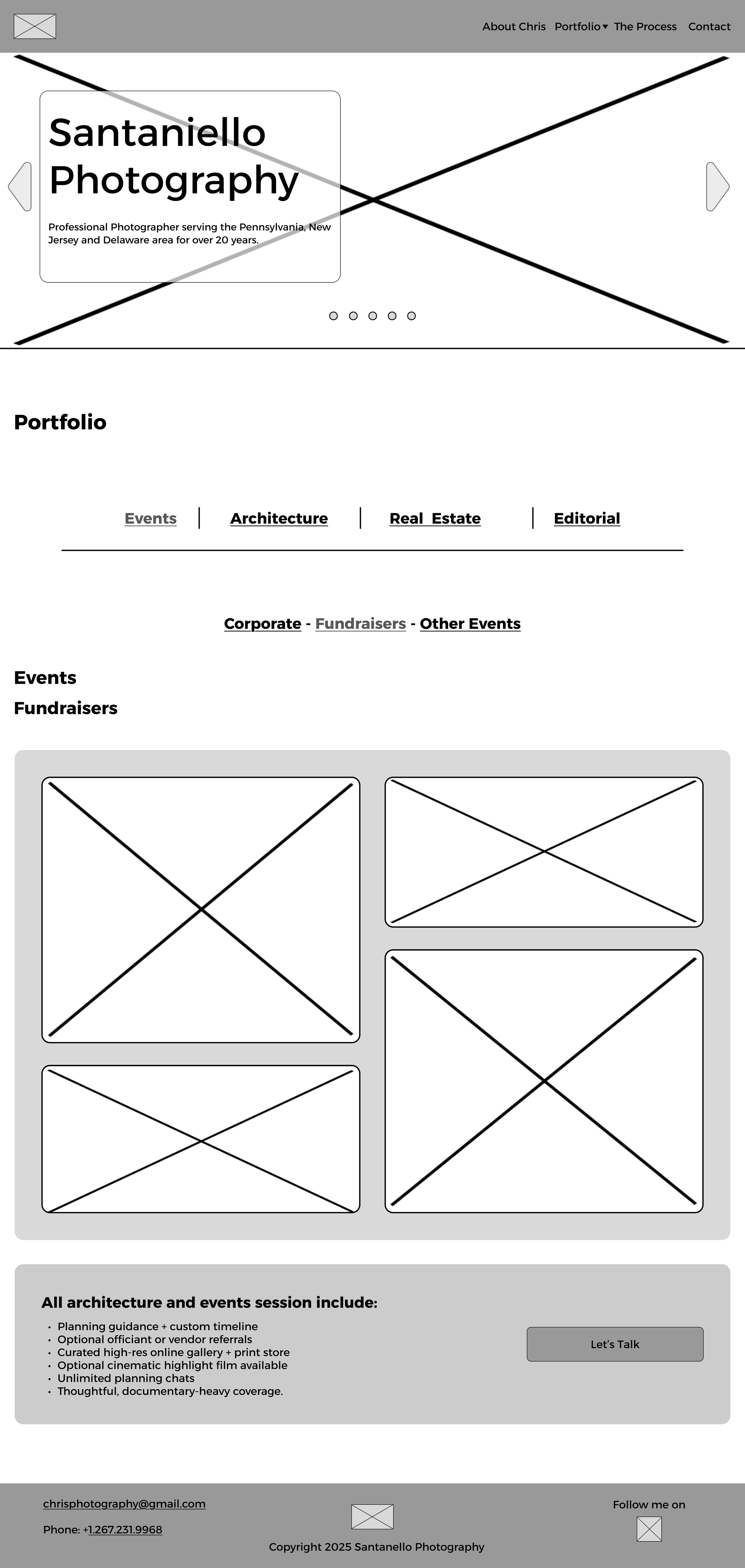
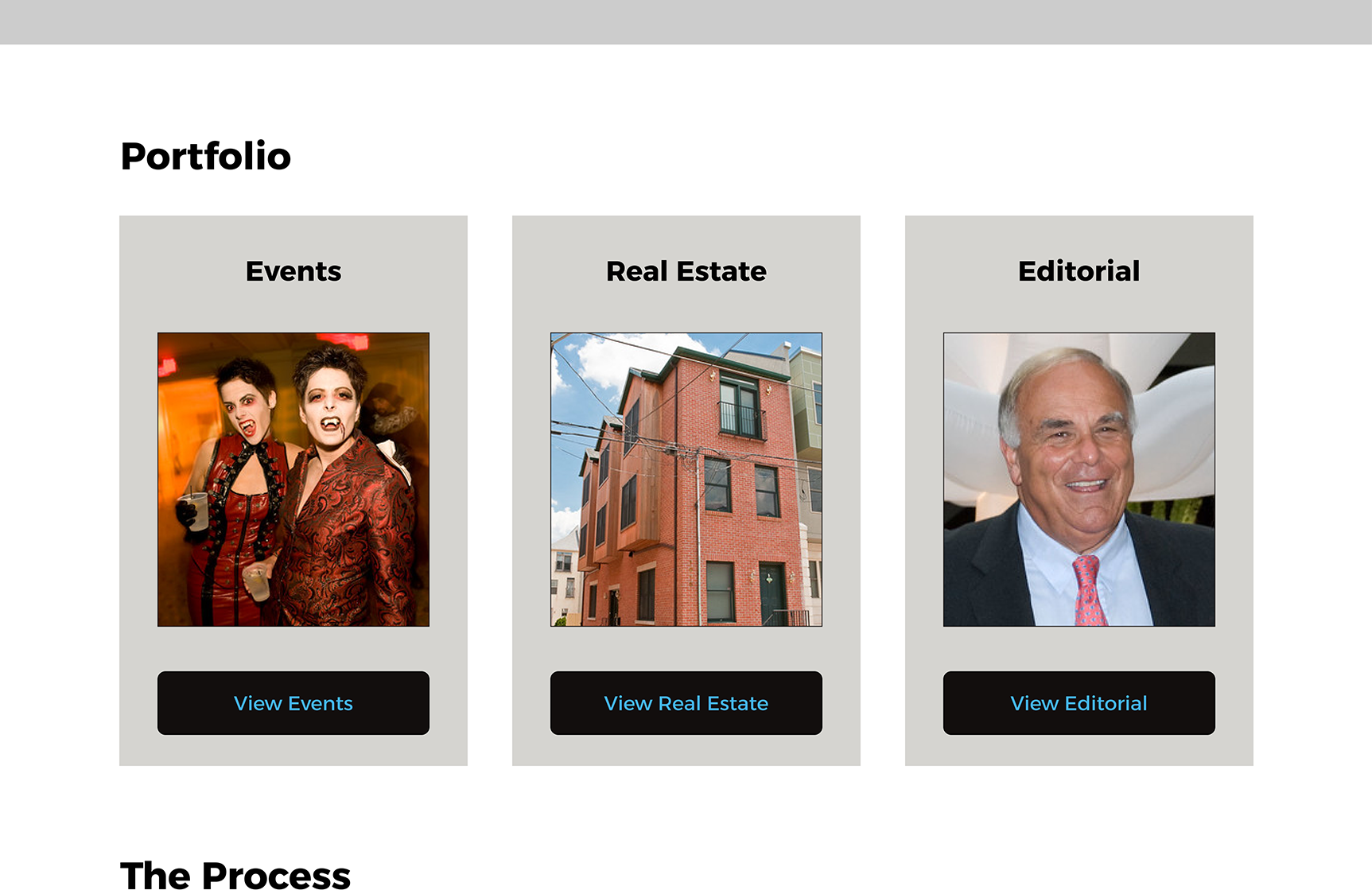
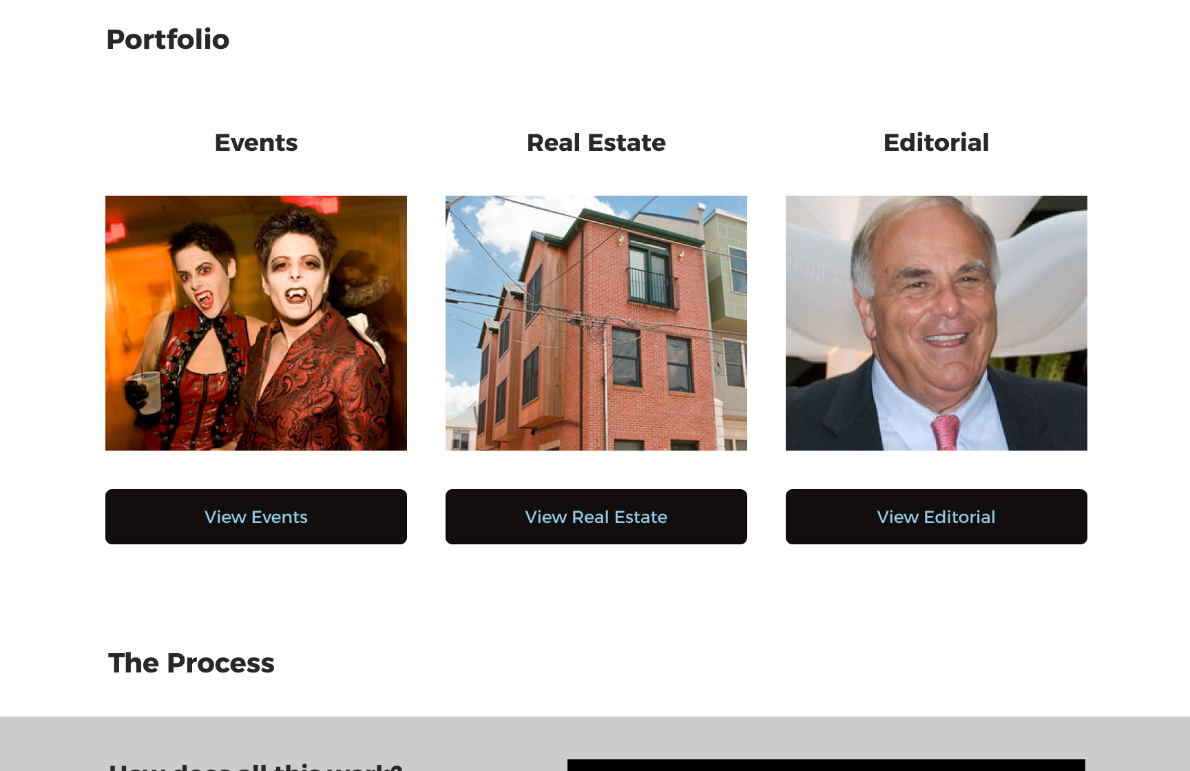
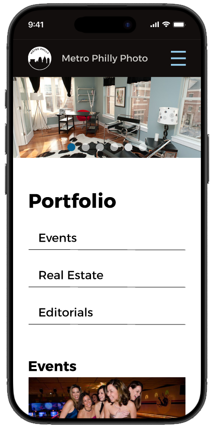
Before portfolio menu
Well glad I did! I noticed a missing page that blocked the task flow. Portfolio page needed to be built out! Not complicated but vitale.
After a follow up meeting with Chris we also refined the portfolio page categories as well naming convention.
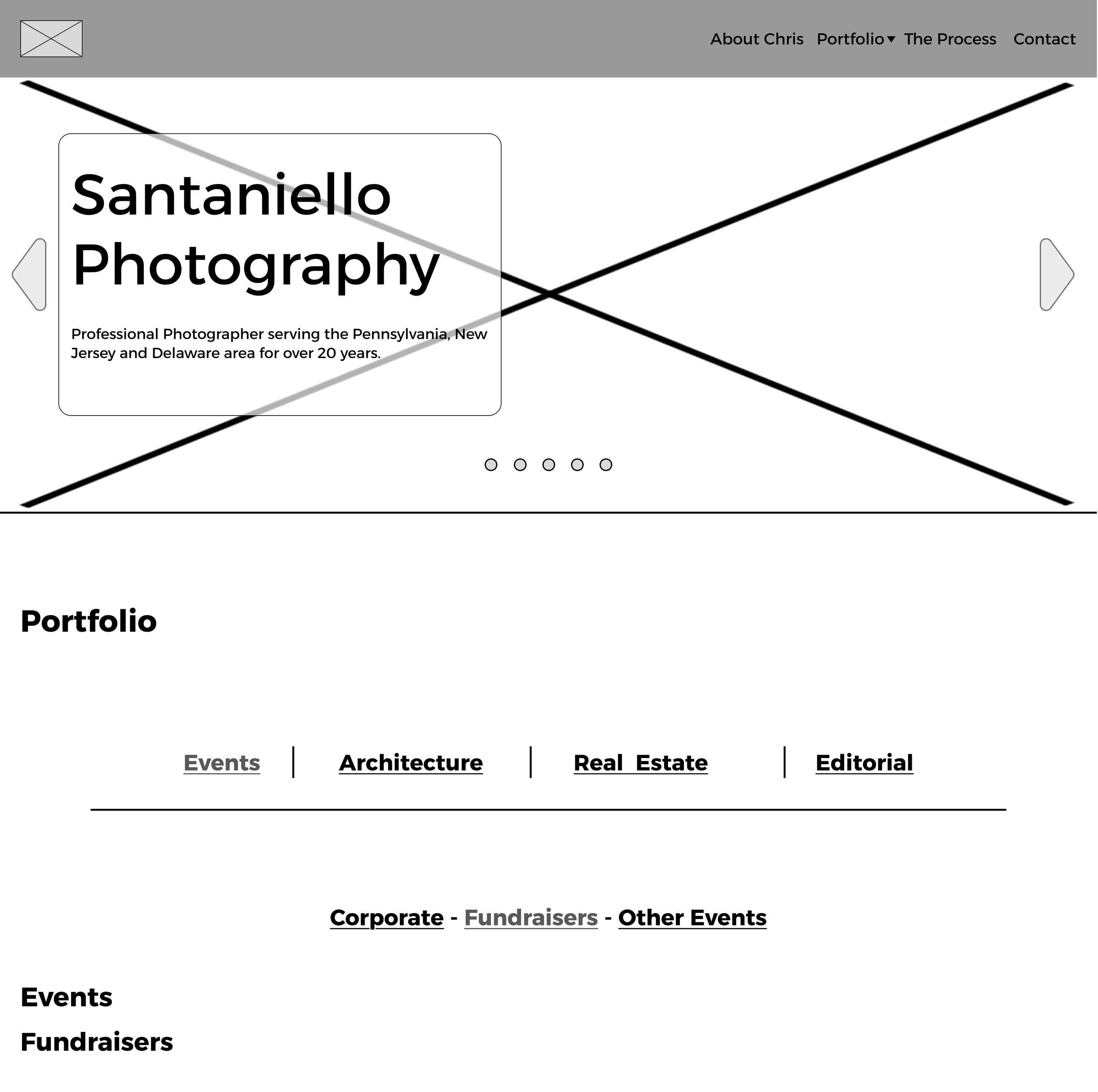
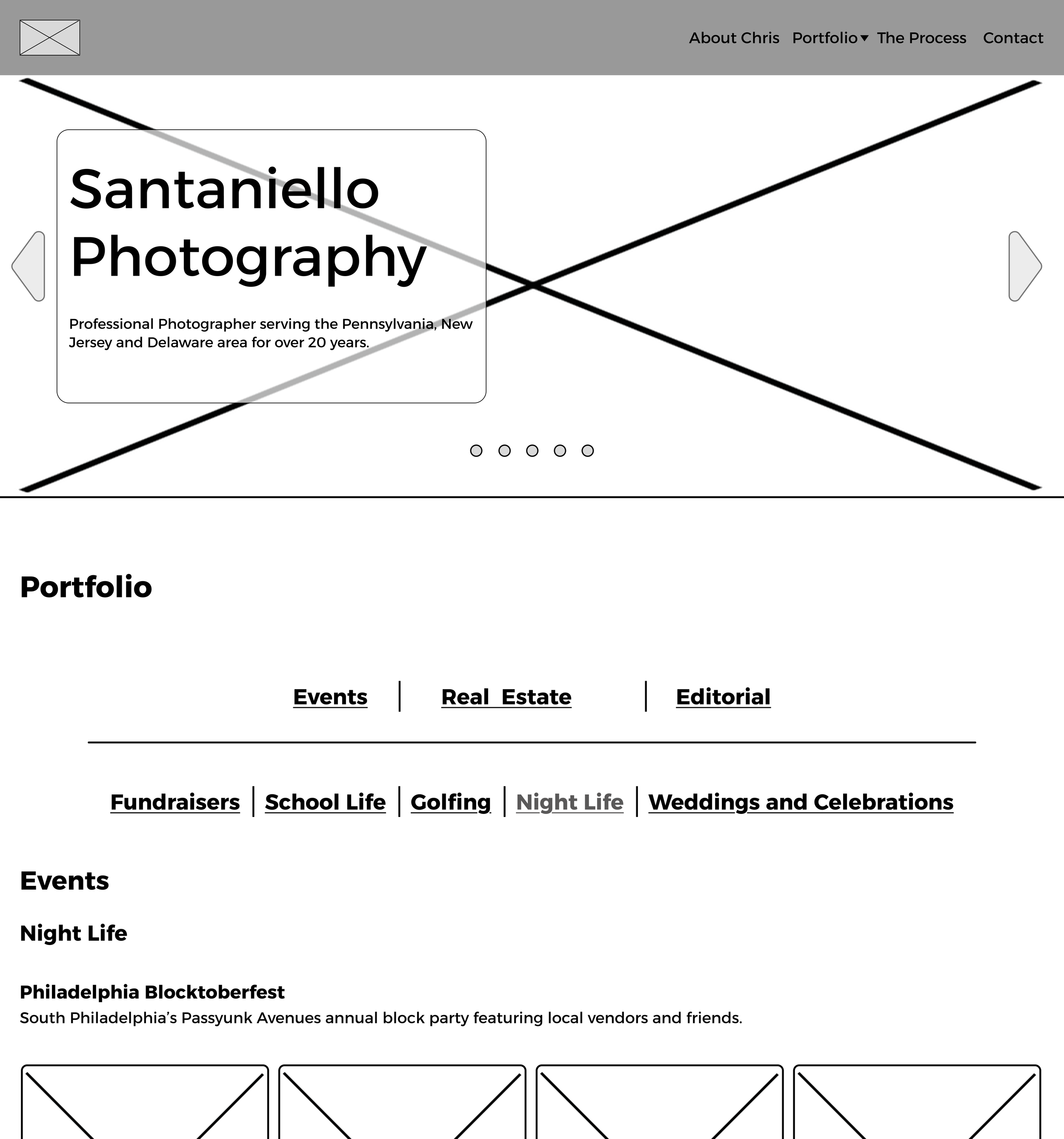
After portfolio menu
We removed Architecture from the level 1 navigation and will merge into Real Estate section. I built out the Events with more specific subsections.
Getting the site into focus
I had a meeting with Chris walking through the Mid Fidelity frames and started talking about color and branding in general
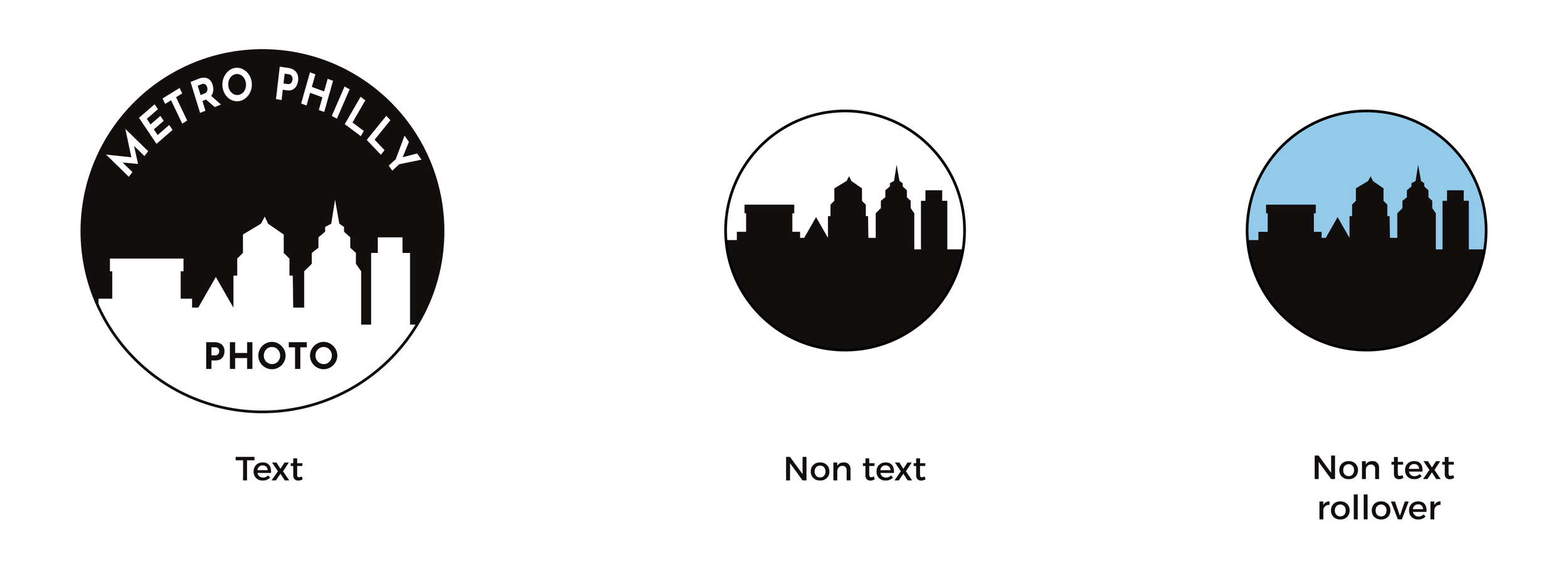
Logo
Chris decided to go with the name Metro Philly Photo with the following thoughts:
He wanted a to use the logo as a watermark as needed.
Something contemporary.
curricular prefered.
Recognizable if red was added.
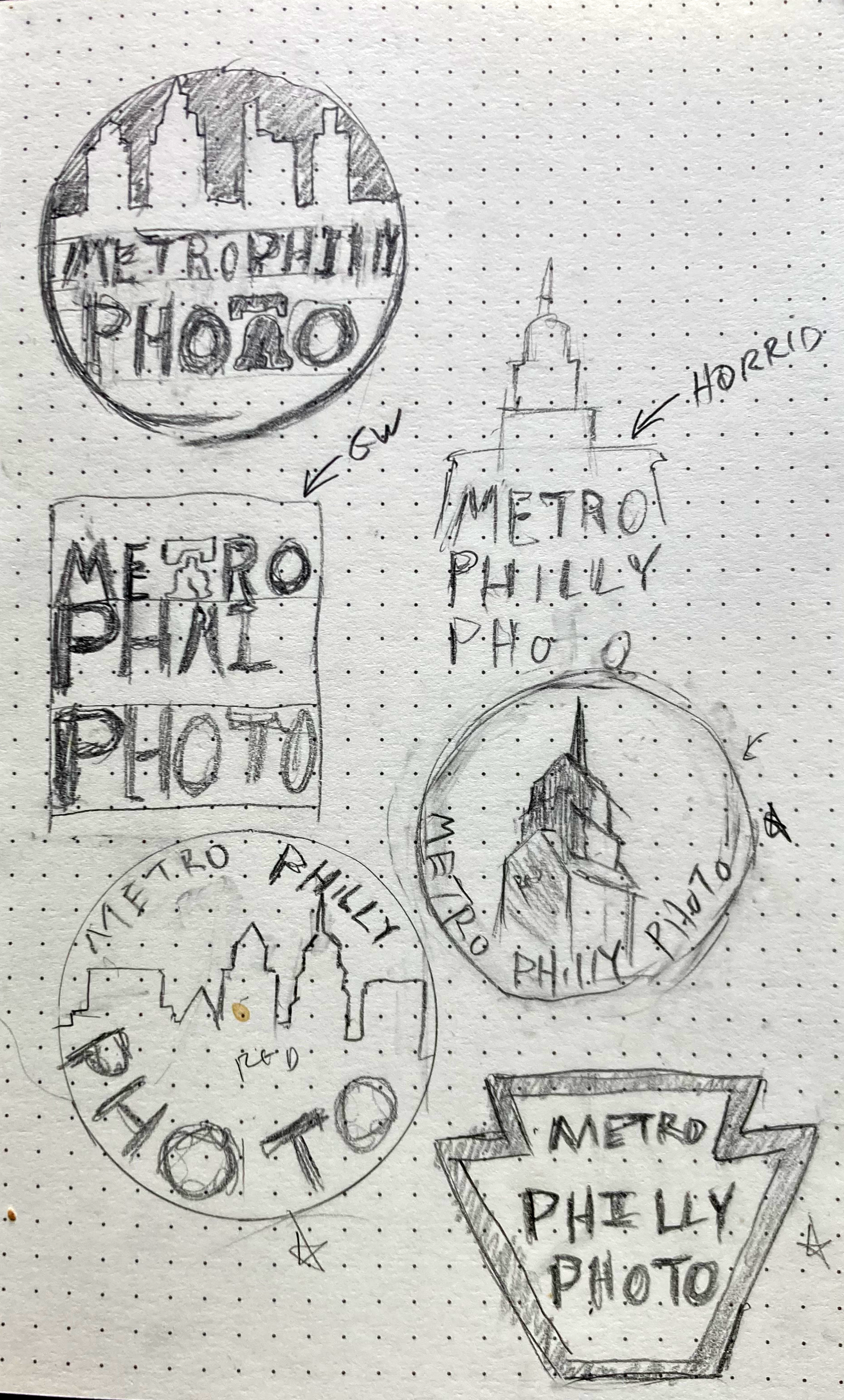
After a few rounds of philadelphia specefic iconic items I went with working the city skyline in a circle. Came up and refined to what you now see.
A large one with text, smaller when the text is not legible and blue and black for rollovers when needed.
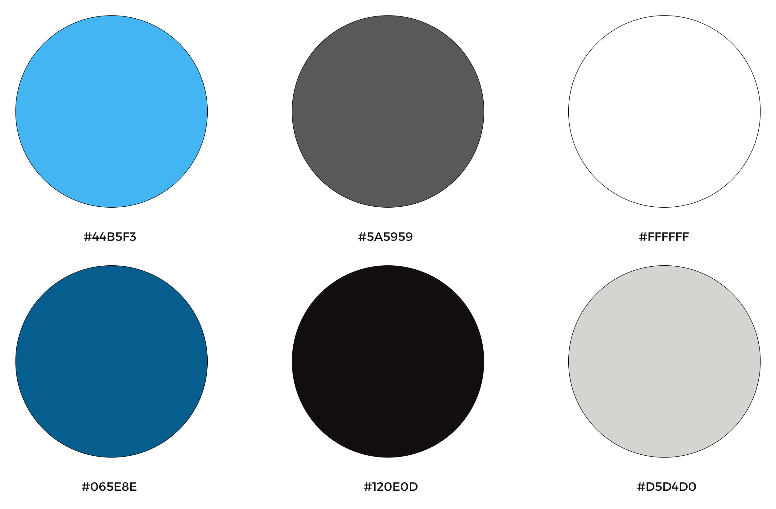
Color pallette
Chris suggested red, grey and blue. We played around with the Mid Fidelities adding color in different possible ways. The red was to distracting against the pictures (You’ll see below!).
We eventually agreed on keeping things neutral with blue as a careful touch of color.
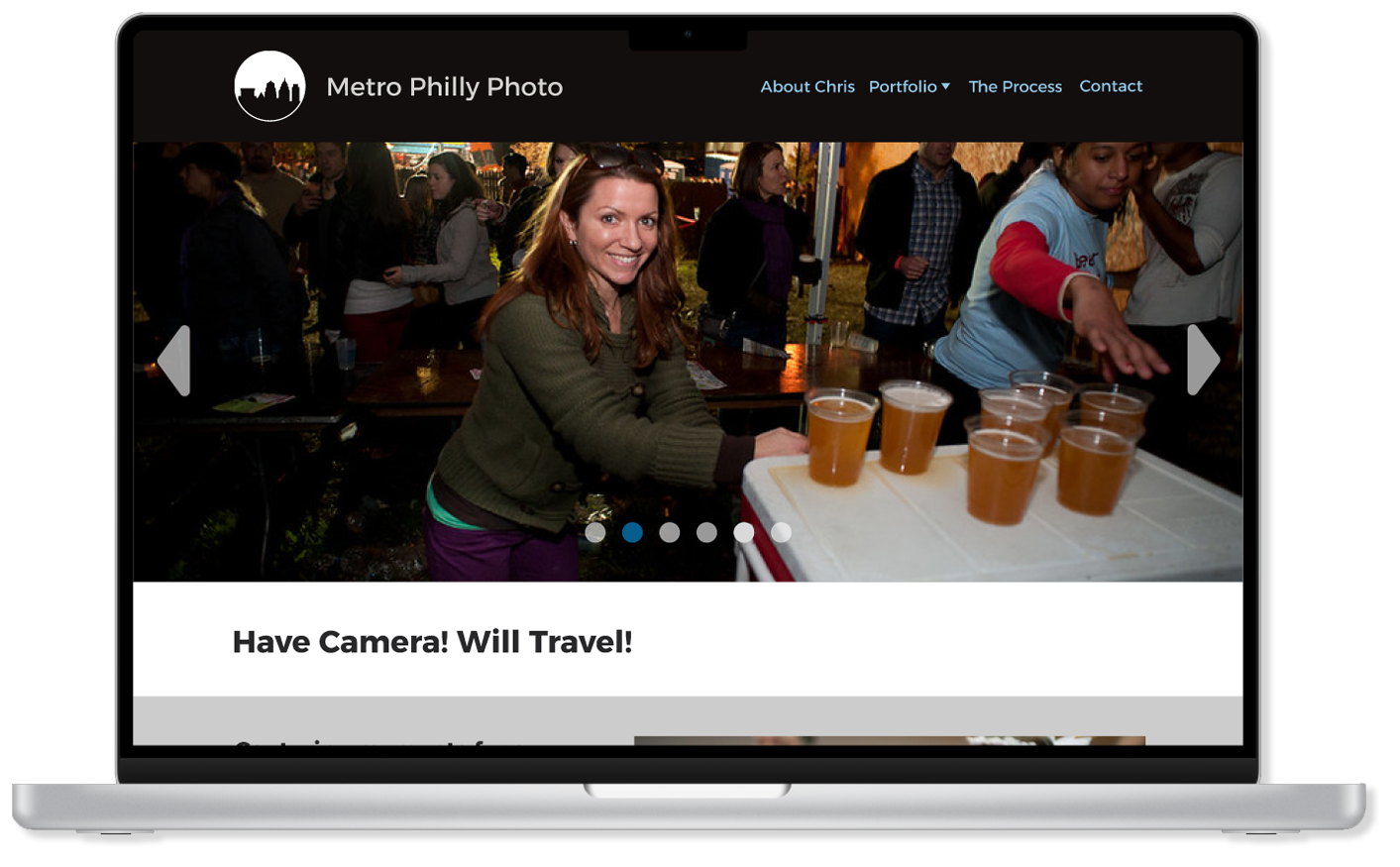
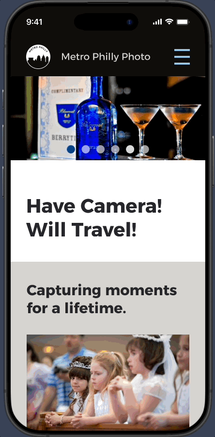
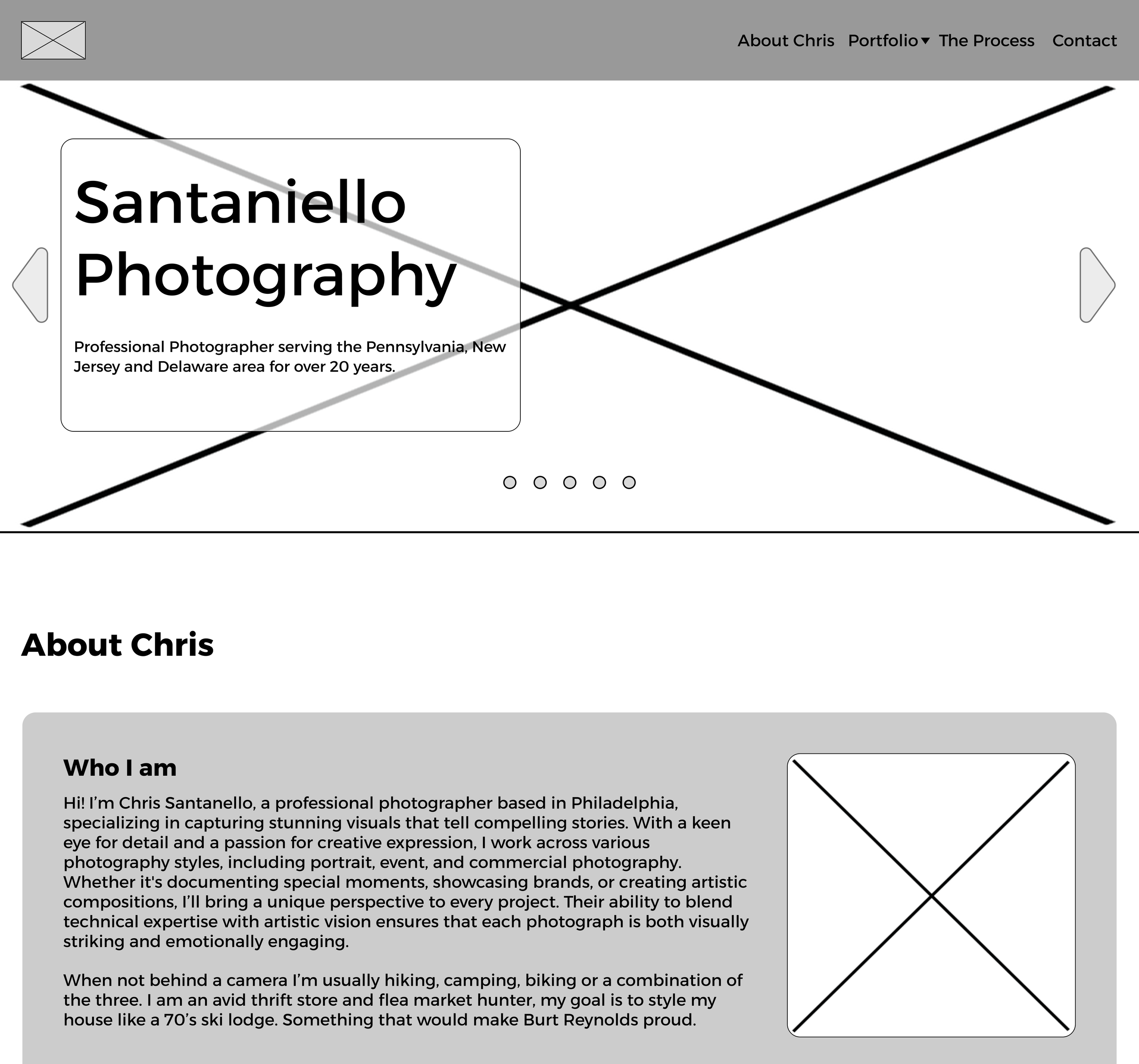
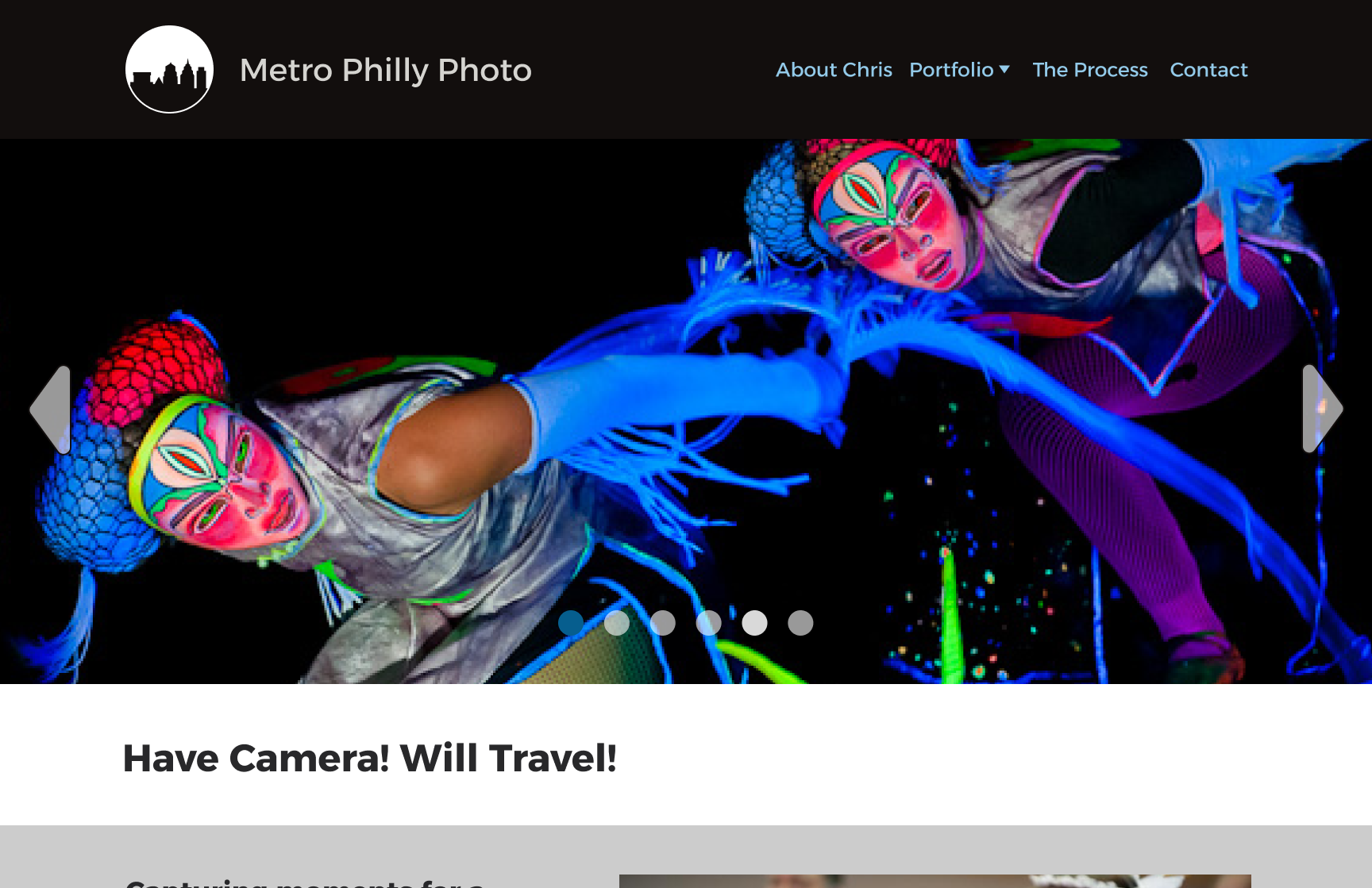
High fidelity
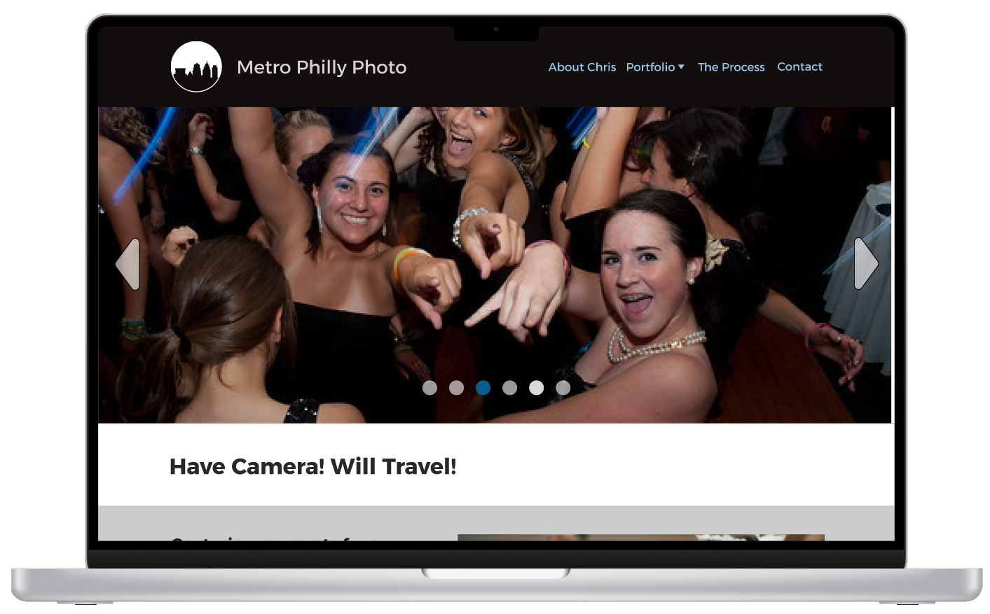
I added the red to the logo as Chris requested, it is taking away from the photos but I want him to see it himself.
I wrote out the process on how everything works because it was a very common my interviewers had. To encourage users to contact Chris the copy needs to be very friendly and written with personality.
I minimised the colors even more. using a warm grey to help break the page up but not override the photos.
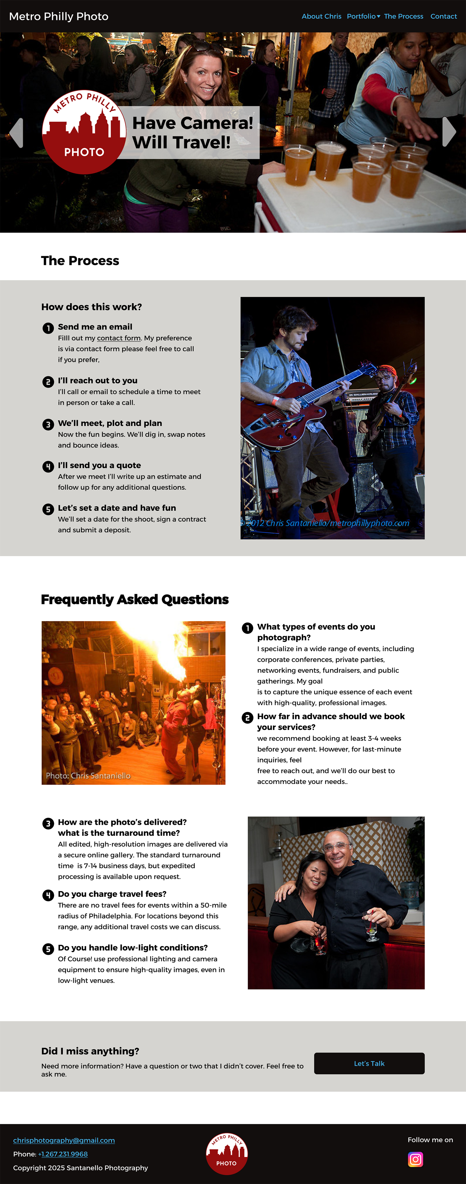

I compiled questions from my interviews that were asked to the photographers they used, I asked Chris his most common questions as well with his answers.
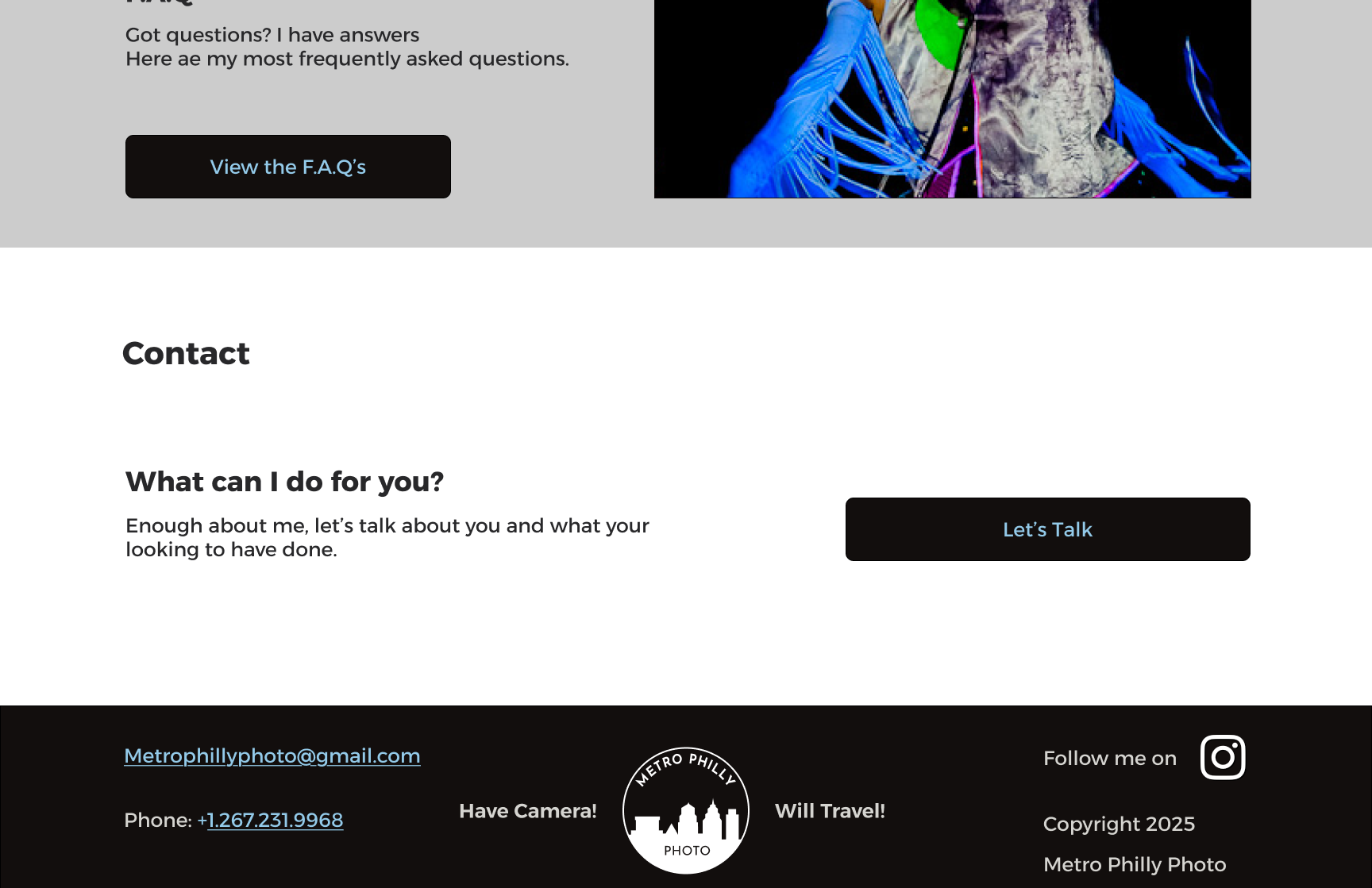
I added a CTA at the bottom of each page to encourage users to contact Chris on impulse.
I did discuss adding pricing to the site. Chris did not feel comfortable adding pricing for understandable business reasons.
Reshoots
While the site is not large testing is still important. I wanted to make sure the Portfolio page navigation was clear and intuitive.
I gave the testers 3 tasks:
“Your daughter's sweet 16 is coming up! You have the hall rented, catering and DJ booked.
Last item is hiring a photographer, you come across a photographer's site and……..”
Find the section that best suits what you need to know about his work for your sweet 16 party.
Find the section that would best answer your questions you have for Chris.
Find a way to contact Chris on the site.
I asked testers thoughts on the red logo and hero in general, as well as language on the site. I also asked his thoughts on these as well.
The problem
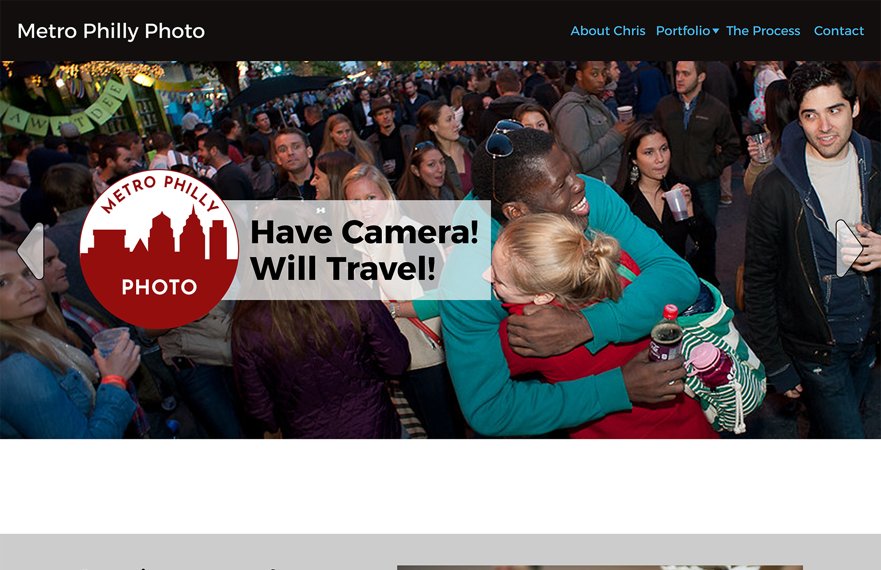
Logo was well received as well as the catch phrase.
Having both over the hero was not. Testers wanted to see the images uninterrupted.
Red was not loved either. They fund it to distracting for the images.
The solution
Swapped red with black and moved logo up to header. Much better!
Dropped the catch phrase to below thee hero on the landing page. looks great and the photos are the focus.
The problem
The majority found the grey to distracting and would rather see more of the images.
The solution
Removed the grey borders and enlarged the images.
The problem
Testers were not sure what the CTA was for.
The solution
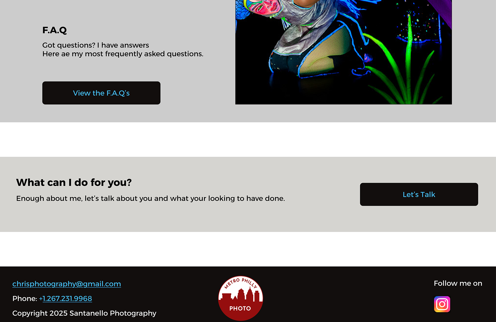
Added a header to all the CTA’s and removed the grey for consistency.
Hand off
Design Approved! After the site is built and live Chris will be taking over the updates and minor design as needed.
Last deliverable will be the UI Kit for him to follow for site wide consistency.


That’s a wrap
Lessons learned
This particular project reinforced how important the copy is on a site or app. Actually this has been an overarching learning throughout the whole course for me. Initially I wasn’t sure why greeking was not used anymore. Now I realize the personality of the copy needs to be in step with the design of the site.
My first round of design ideas took away from the photos…the purpose of the site is making the photos central.
I realized I was being different just for the sake of being different. Once I stepped back and focused on the purpose of the site, things started to come together.
Final thoughts
Chris is an excellent photographer, I want to see him reach his goals of being full time. He is very excited to have the design turned into a live site promoting him on the web.
It was rewarding to work with a client again, discussing the project, developing and evolving the design from concept to comletion.