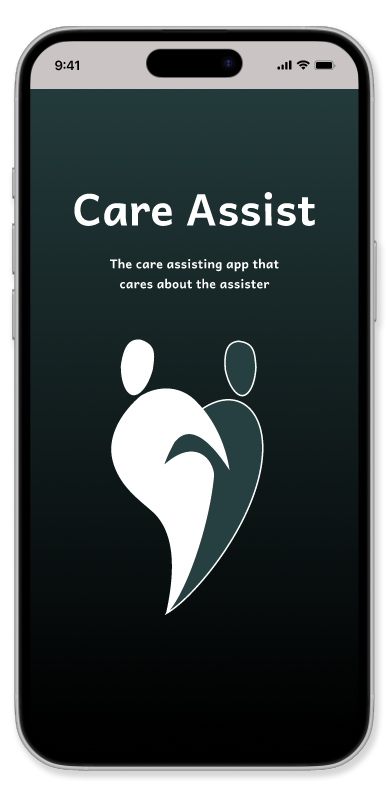
Care Assist
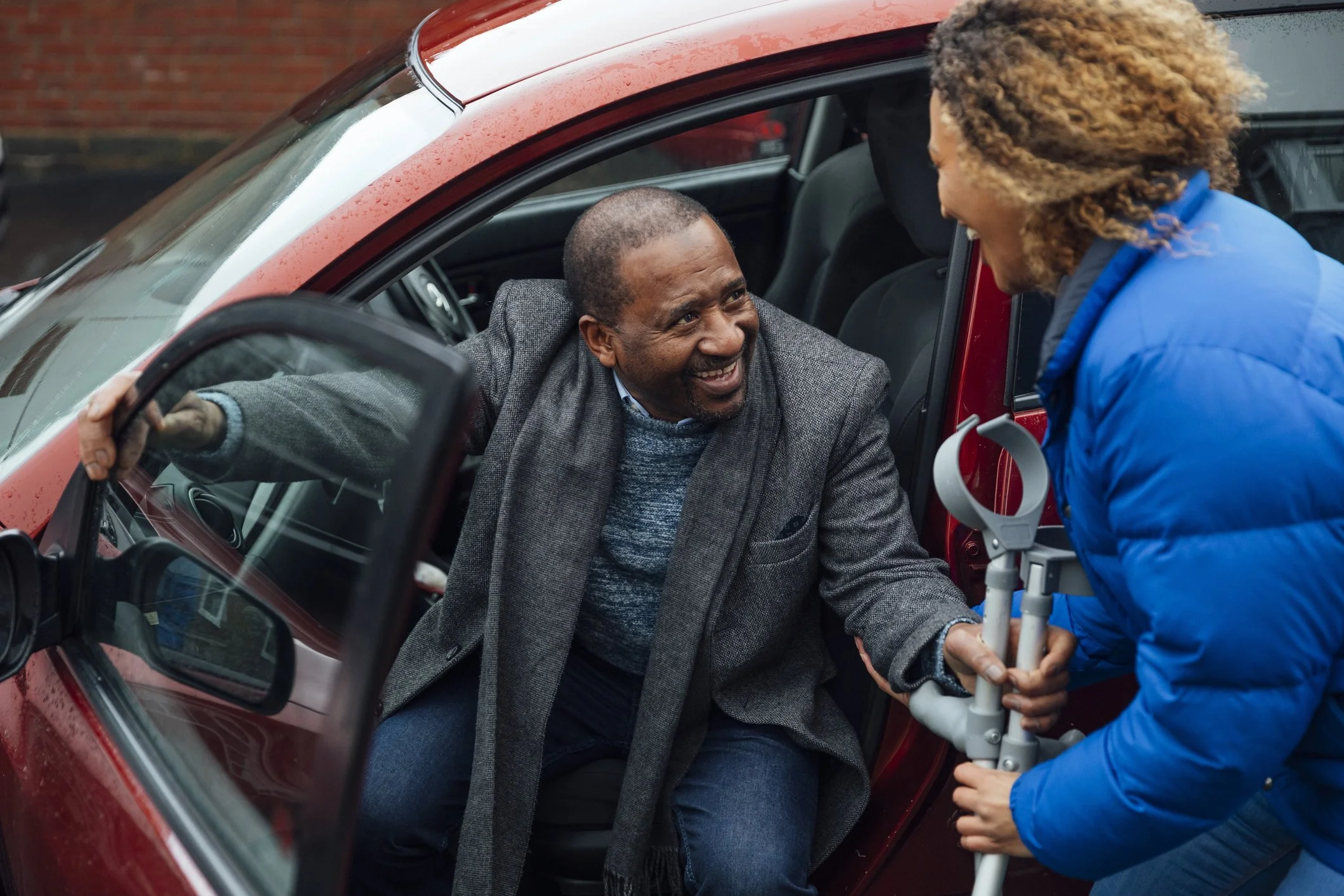
Some point in your life you will end up taking care of a loved one that is growing older, injured, ill or sadly, handling end of life care as well as the funeral arrangements. Not an enjoyable topic but one that needs to be addressed. The caregiver's health needs to be addressed as well. You can’t take care of someone if you're not in good health.
The problem
Talking to others I found out I wasn’t alone with handling a loved one needing assistance, not sure what next steps were as well as the struggle to keep organised with the care they needed. Something centralized was needed to assist, educate and help with organization.
Goals
The creation of an app that encompasses a broad range of care: warning signs that care should start. what to do when the loved one passes. Covering not just what you need to do but having consideration for the caregiver's well being as well.
Roles
Researcher
UX Designer
UI Designer
Testing Cordinator
Research
One on One interviews
Questions were focused on what the care was and lessons learned from it. Additional discussions were about mental states of Loved Ones and caretakers as well as funeral arrangements.
I feel this was cathartic for them, having a chance to vent about the experience for the first time. More on that later.
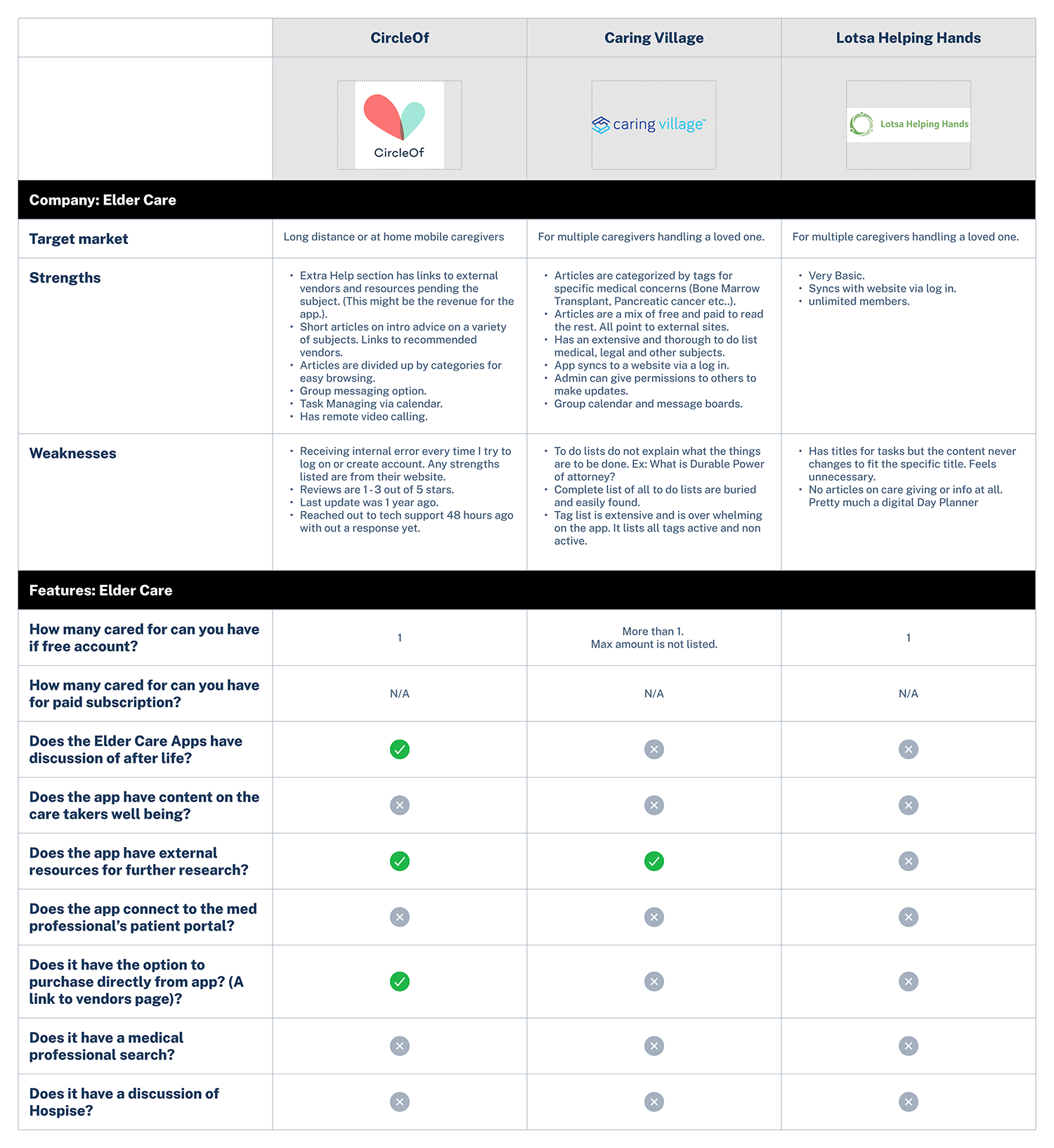
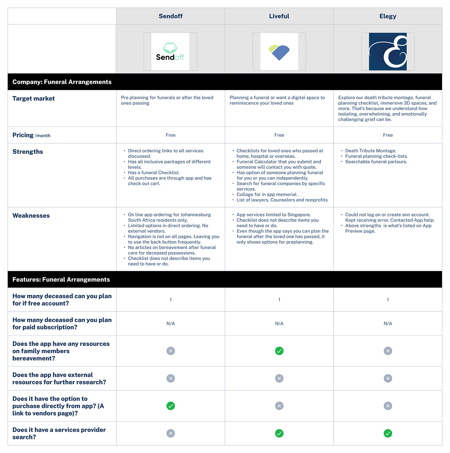
Secondary research: Competitor research
The three big takeaways:
Apps only covered a specific subject. One for funeral arrangements, one for elder care, one for medication tracking. Nothing all inclusive.
Apps were vague with the information. A Lot of the apps used terminology without definition. Others offered resources limited to a specific region like Singapore or South Africa.
Buggy! Buggy! Buggy! Some apps never opened, others were riddled with internal errors.
Deliverables
Affinity map
Helped organize the key responses and group them to discover common issues.
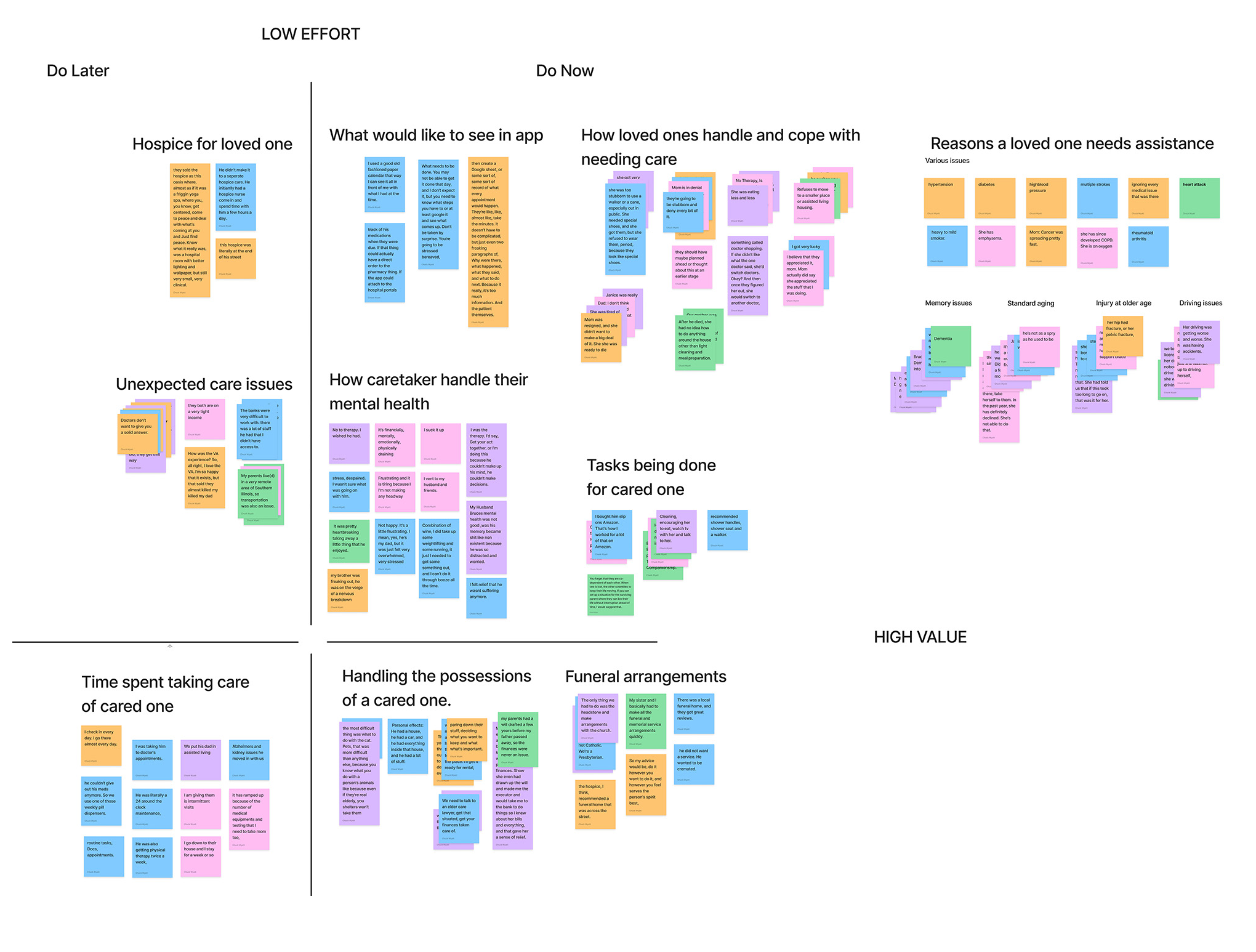
Interview discoveries
Caregivers did not prioritize their mental health, bottling up their thoughts and emotions.
Caregivers just dove in and started caregiving.
Information overload set in, everything was the same priority level.
Most caregivers took care of loved ones locally , some managed out of state via the internet, phone calls and remote video.
Empathy map
Helped me take the key responses and frame them into the interview discoveries.

Define
Personas


Goals
Problem Statements for End To End App

POV#1
Taking care of an elderly loved one can be bewildering with what to do first and how to do it.
HMW#1
How can we get a new healthcare provider up to speed on what they need to do.

POV#2
Scheduling all the appointments for an elderly loved one while managing your life can be daunting, coordinating with an assisting provider even more so.
HMW#2
How can we coordinate the loved ones appointments with multiple care providers?
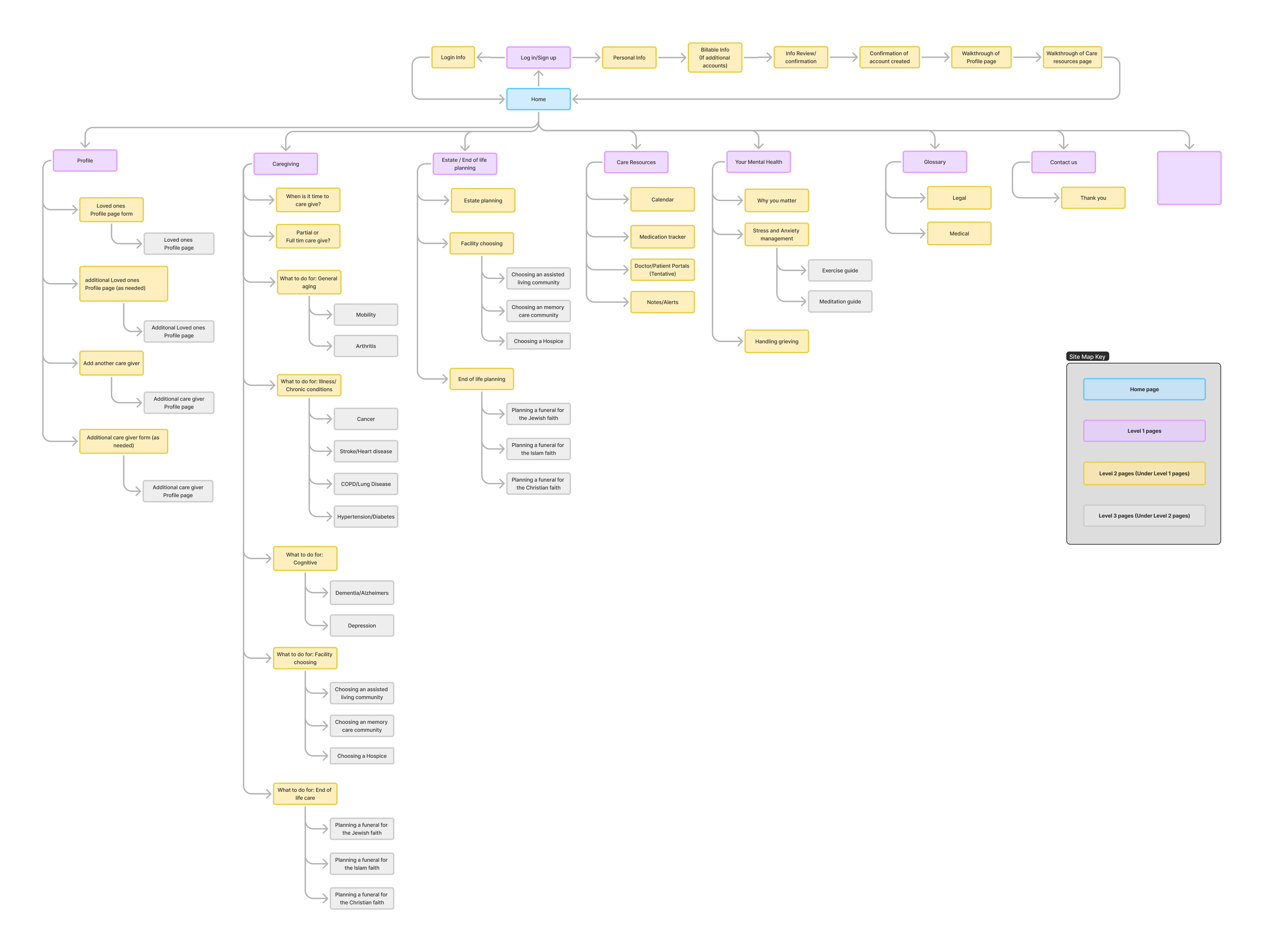
Sitemap
Once laid out I realized how extensive the app could be.
Being aware of development time and cost I needed to prioritize deliverables on launch and what will be for phase two.
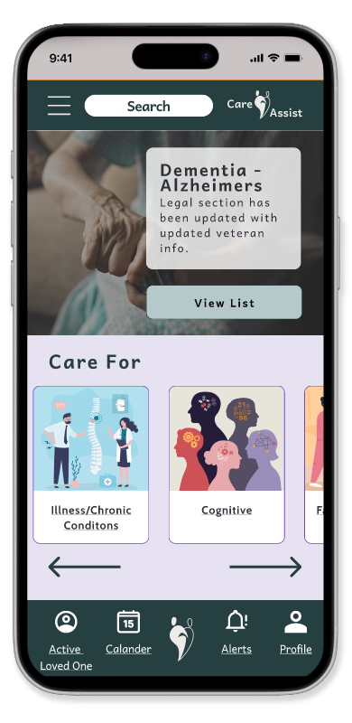
Feature set prioritization
Must have
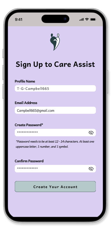
Account creation: One free profile, additional profiles will be pay as needed.
To do list: Checklists for common caregiving scenarios
Glossary: Glossary for terms that may not be familiar to the caregiver that will appear in the App.
Mental health resources: Tools on how to handle the mental of the caregiver.
Calendar for caregivers: To add appointments and share with additional caregivers. App will update to the device calendar as well.
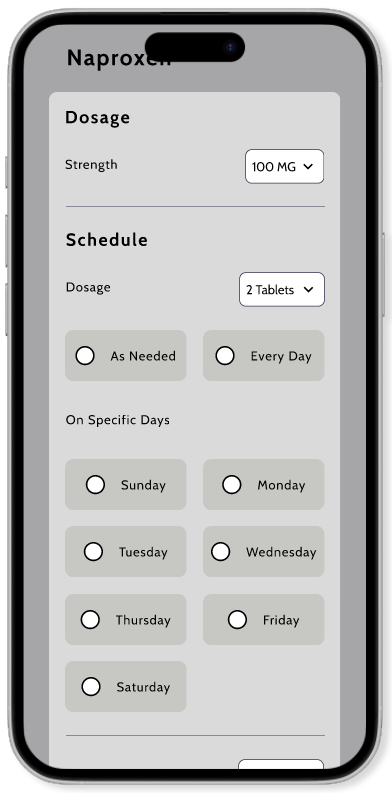
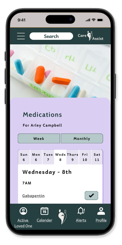
Medication tracker: Keep track of what meds are given on what day.
Notes section: For additional comments and reminders for the caretakers.

Nice to have
Doctor Section Portal: Keeping all Doctor/Patient portals organized in one location.
If time
Ordering functionality: List of items with discount for ordering through the app.
More end of life resources: More content on hospice, funeral arrangements and estate handling.
Next day
Map search: Search for local hospitals, doctors, therapists, medical supplies, hospice, rehab, funeral, etc..
User flows
Adding a secondary caregiver to your loved ones profile your caring for.

Adding and scheduling a new medication to your loved ones medication list.

Design time!
Not quite yet…
Before diving into thumbnails a few more things are needed for visual guidance.
Mood board
Searching various design sites for inspiration I created a moodboard with ideas for design and color concepts.

Core values
I took this time to also create the Core Values for the app:
Guidance in helping a first time caretaker.
Reassurance that as daunting as the situation is, it can be accomplished.
Organization with all the responsibilities being handed over to the caretaker.
Confidence with all the needs to be done.
Clarity in helping to understand all the new information and responsibilities a caretaker will be facing.
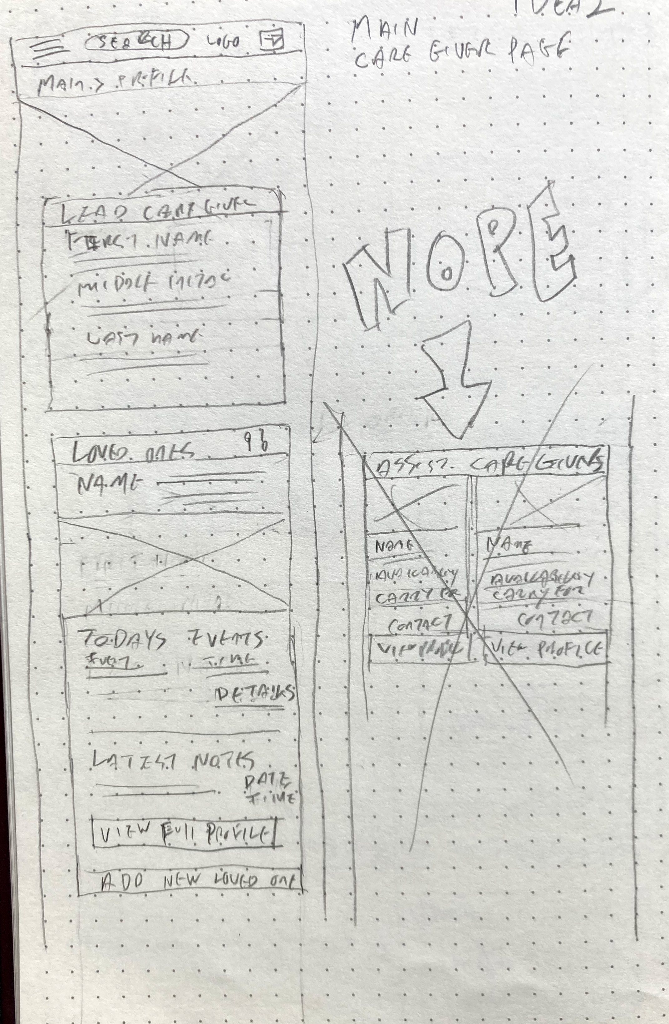
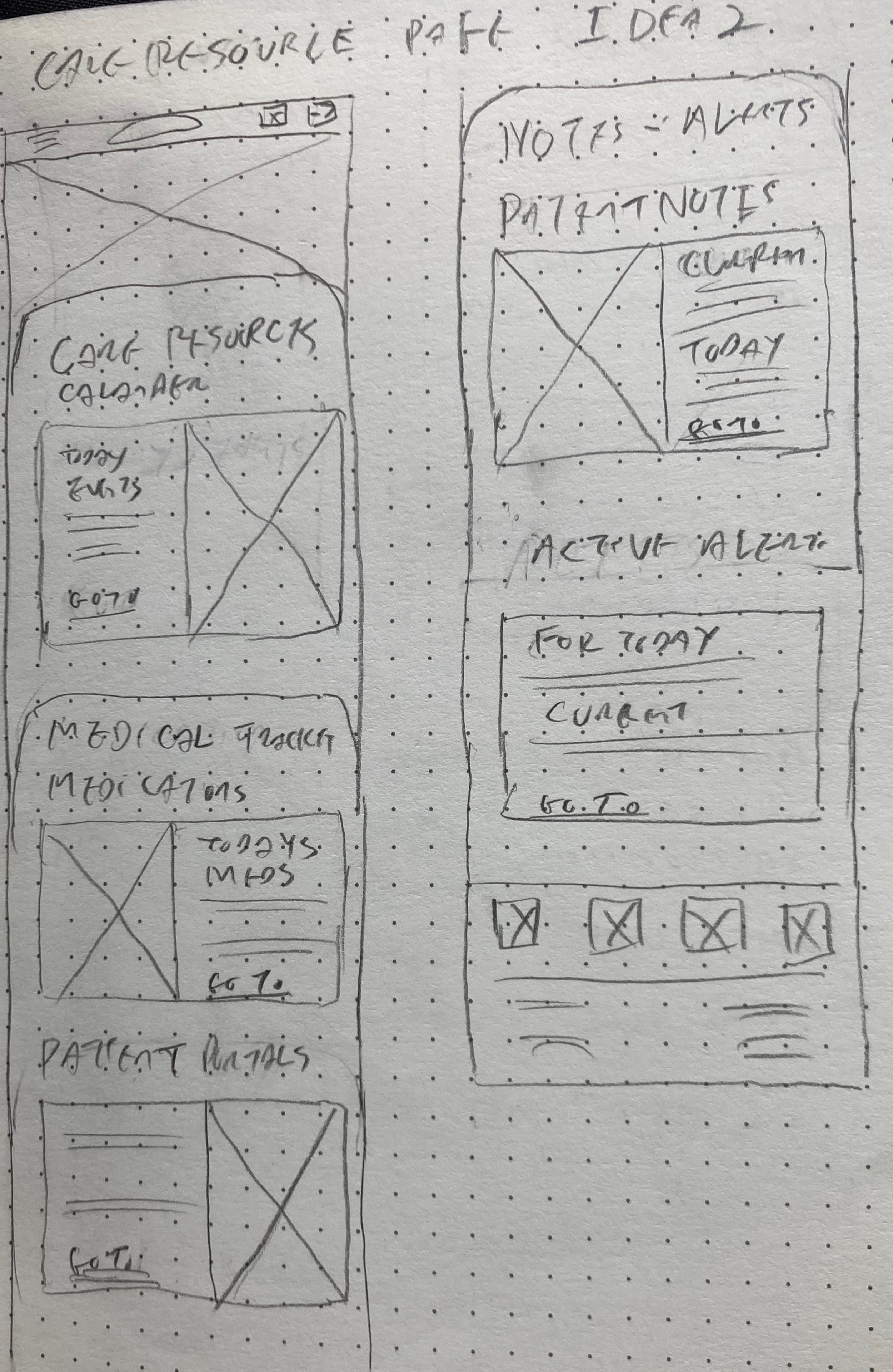
Lo fidelity
I started working through layout ideas on paper first. I find it faster than using Figma at this step and limits the urge to start tweaking to a finish.

Mid fidelity
From paper to Figma. Things are starting to take shape!
I started creating components now so I can easily update with colors as well as the typeface when I go to Hi Fi development.

User testing
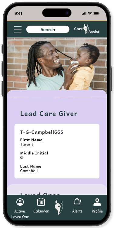
Before going to High fi development I circled back to a few of my interviewers as well as a ER Nurse to walk through the Mid Fidelity.
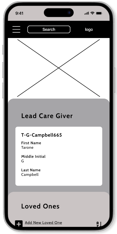
Some minor changes to the icons “loved ones” and “your profile” icons were not made clear as well as needing some additional links on the Lead Caregiver profile page.
Overall the app was well recieved and interviewers brought more ideas for next day deliverables. While not a focus in the user flow the acknowledgement of the caregivers mental health section was greatly appreciated.
Branding
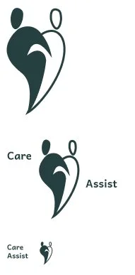
Logo
I wanted something simple, clean and readable in any color.
The logo needed to express compassion and assistance. I initially tried to avoid overused hearts. After some time and a few thumbnails the hearts started to come in, they are recognised them as compassion and caring which lead me to the final design of someone assisting another in a heart shape.

Color pallette
I decided on colors that were emotionally calming and easy on the eyes for extended periods of time.
As with anything in development nothing is written in stone.
Just when I decide I have finalised my palate…..Will get to that in a minute.

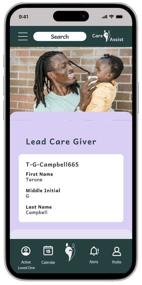
High fidelity
Colors chosen, logo developed, Typography selected It’s time to put it all the togethor. I updated the Mid fi components, made the spacing consistent on all screens, added animations interactivity to the menu, button and links as needed. The color palette needed some refinement (told you!), some of the colors didn’t really look too great next to each other when building the High fi screens out.
User testing
I had volunteers that haven’t seen the app before in any point of development. I wanted to have testers complete a few tasks and didn’t want any previous knowledge of the design.
I gave the testers 3 tasks:
Go to your profile page.
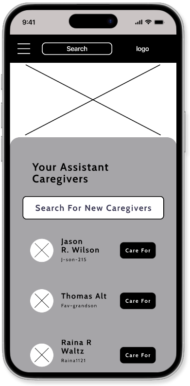
Add a new assistant caregiver to your loved ones profile
Add a new medication.
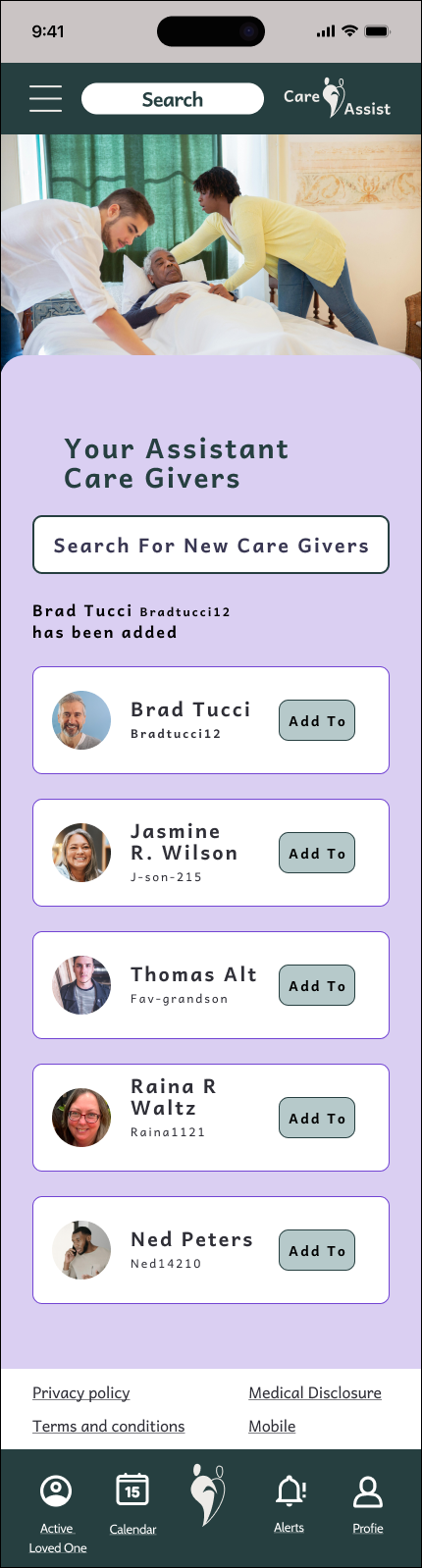
This is why we test
I had some minor design arrangements to modify like legal notices were hidden under the footer navigation. The majority had trouble with adding the new assistant caregiver to your loved one.
The problem
Testers averaged 10-30 seconds to realize the screen was scrollable.
Clicking the “Add To” button didn’t move the screen or give an indication more input was needed.
A few felt this screen had too many steps to complete.
Legal was not noticed at the bottom of the screen.
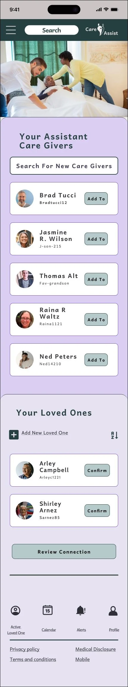
You can also see how easily legal was missed.
The solution
I realized I needed less screens. I over designed the experience!
I removed the “Your Loved Ones” section including the “Review Connection” button. You go directly to the confirmation modal.
I also added an alert when an assistant care giver has been added.
I moved the Legal tile up and gave it a white background to help it stand out .
Wrap up
Lessons learned
This was a challenging experience. Particularly with budget and timeframe for launch day deliverables.
Final thoughts
I’m excited about the potential of Care Assist. What started as an idea for a few what to do lists has evolved into overall caretaking.
Next steps include syncing patient portals, equipment ordering, and reviews as well as care for the health of the caregiver themselves.